After 4 years studying Communication Design at FBAUP, Marta has found hidden between the covers of book a world she’s excited to dive in, interested to explore how to create captivating works in the field of editorial design.

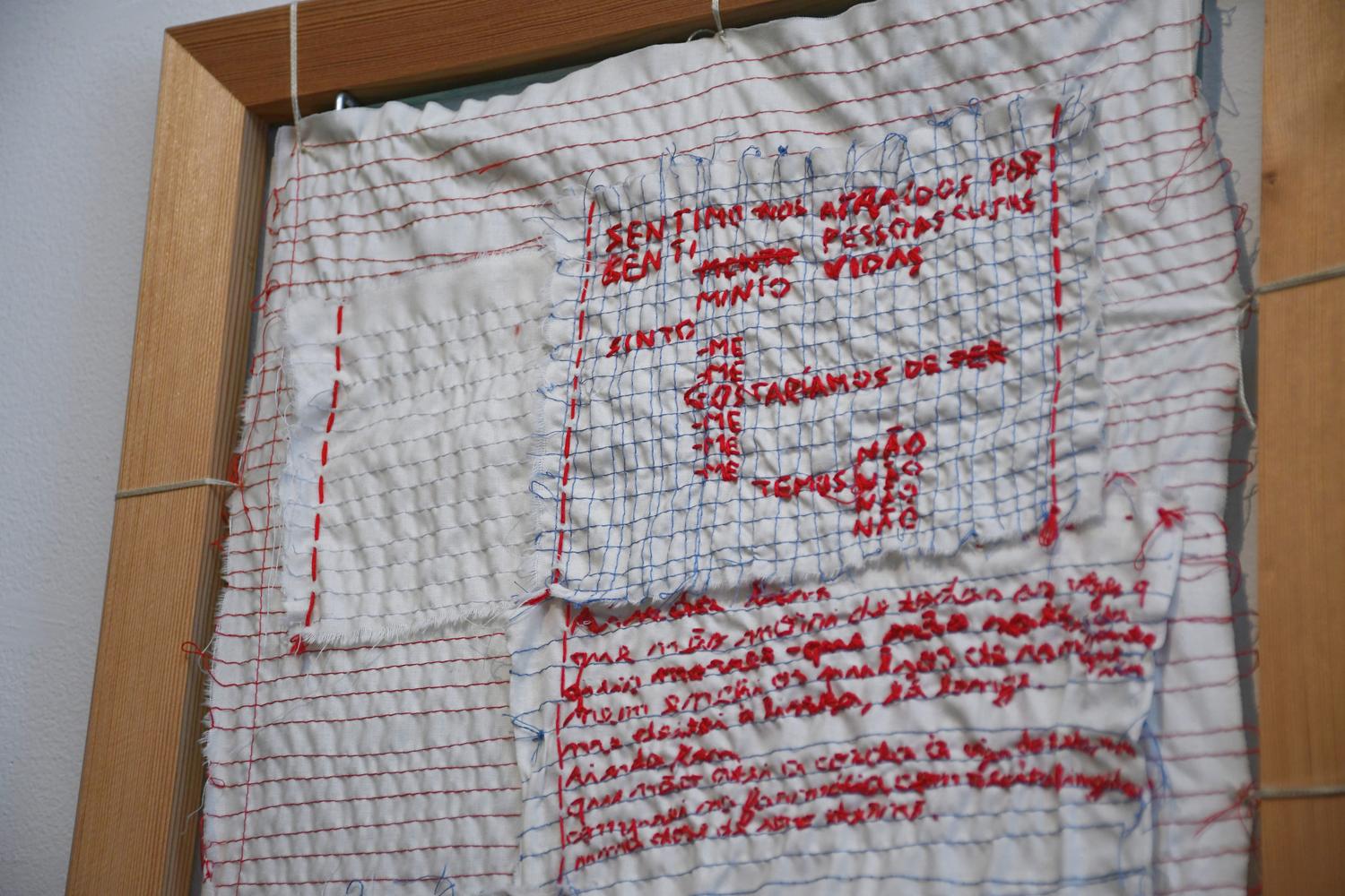
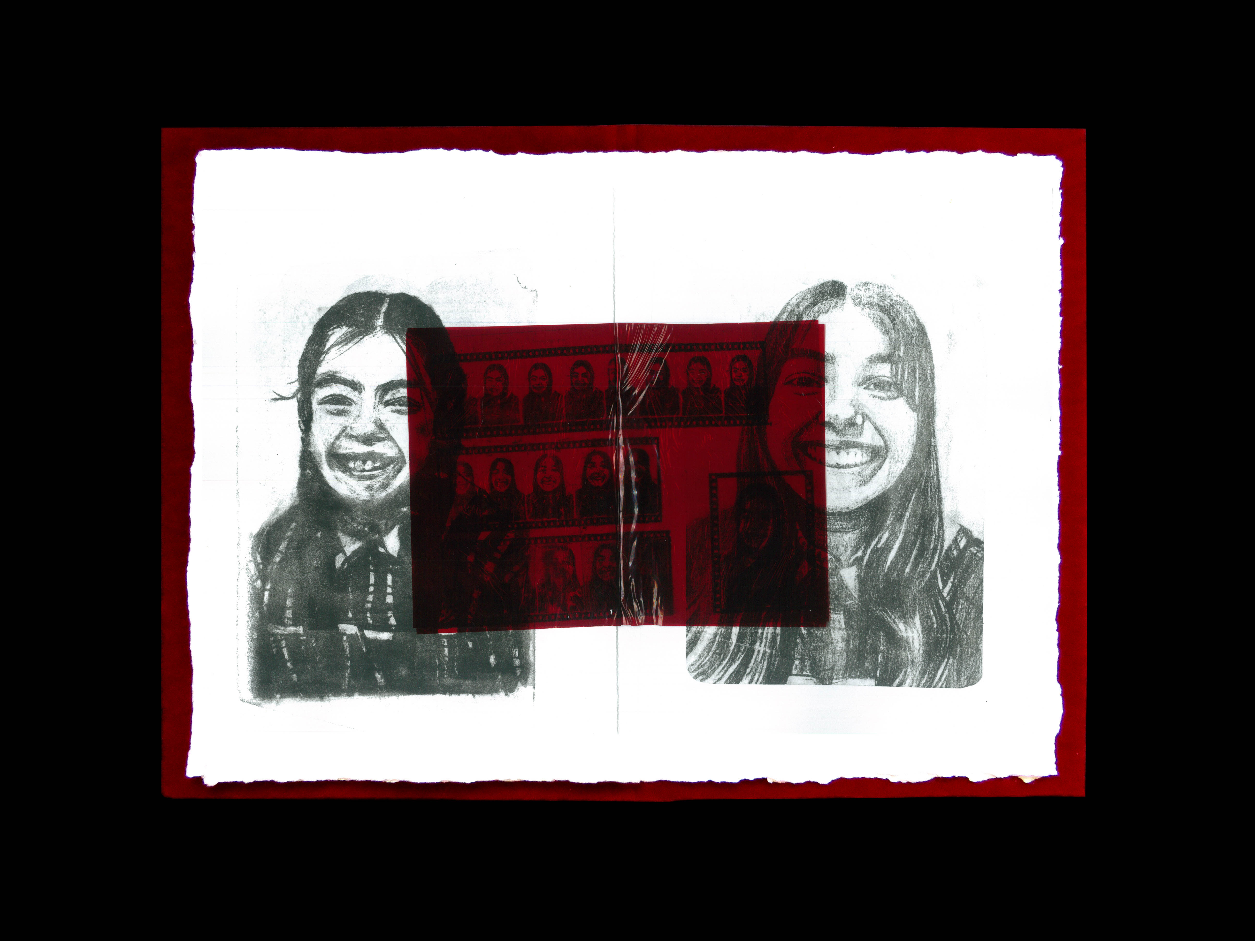
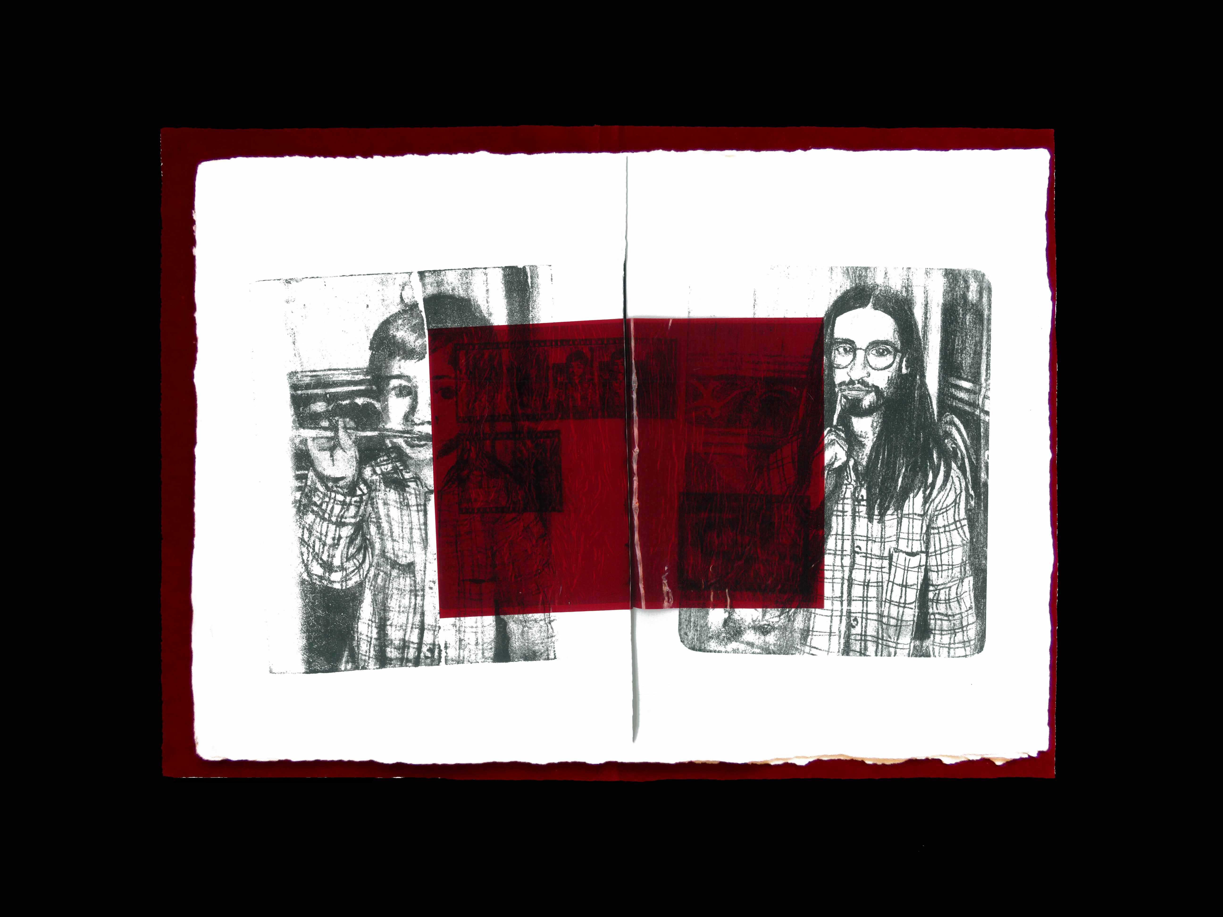
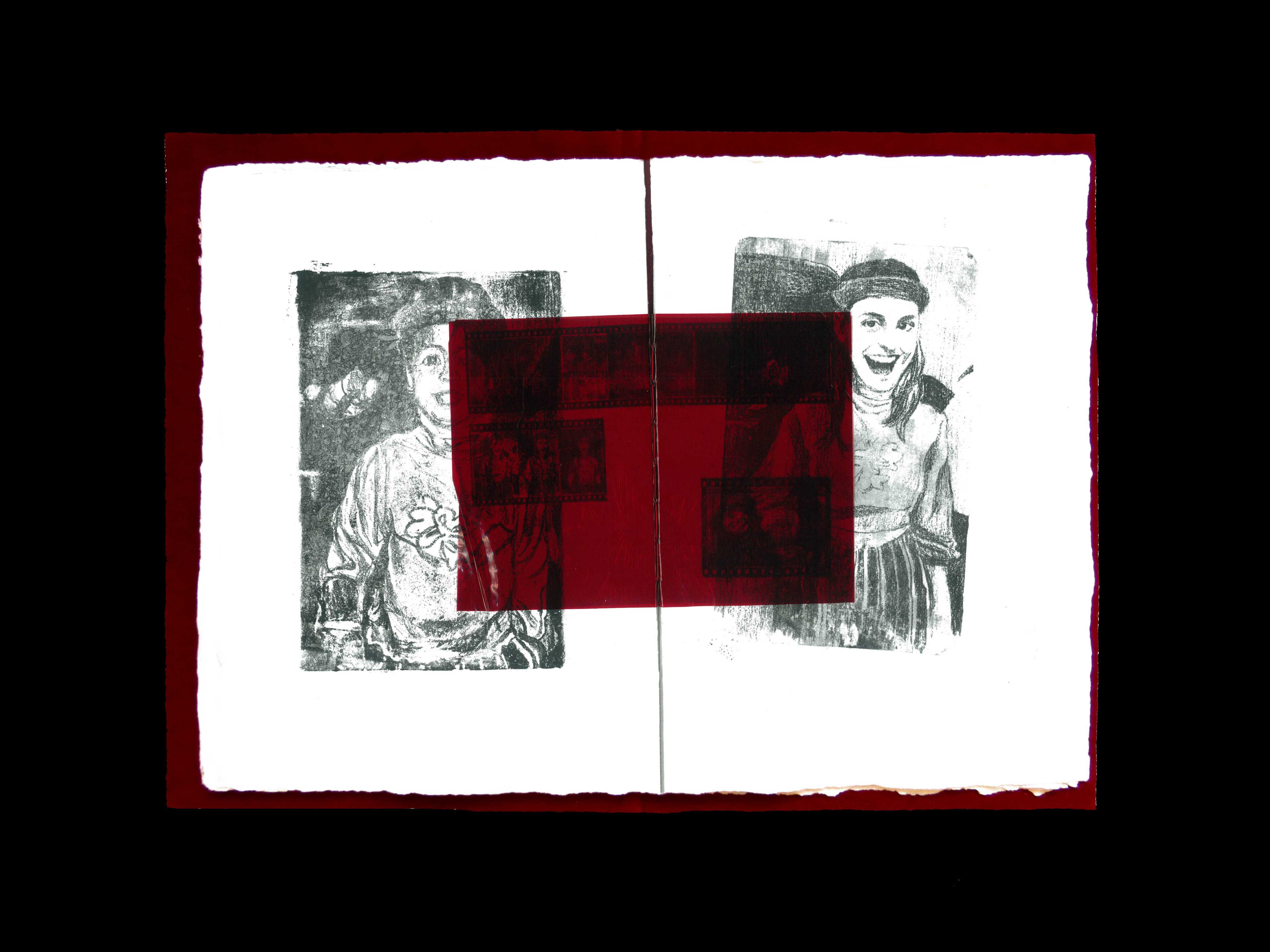
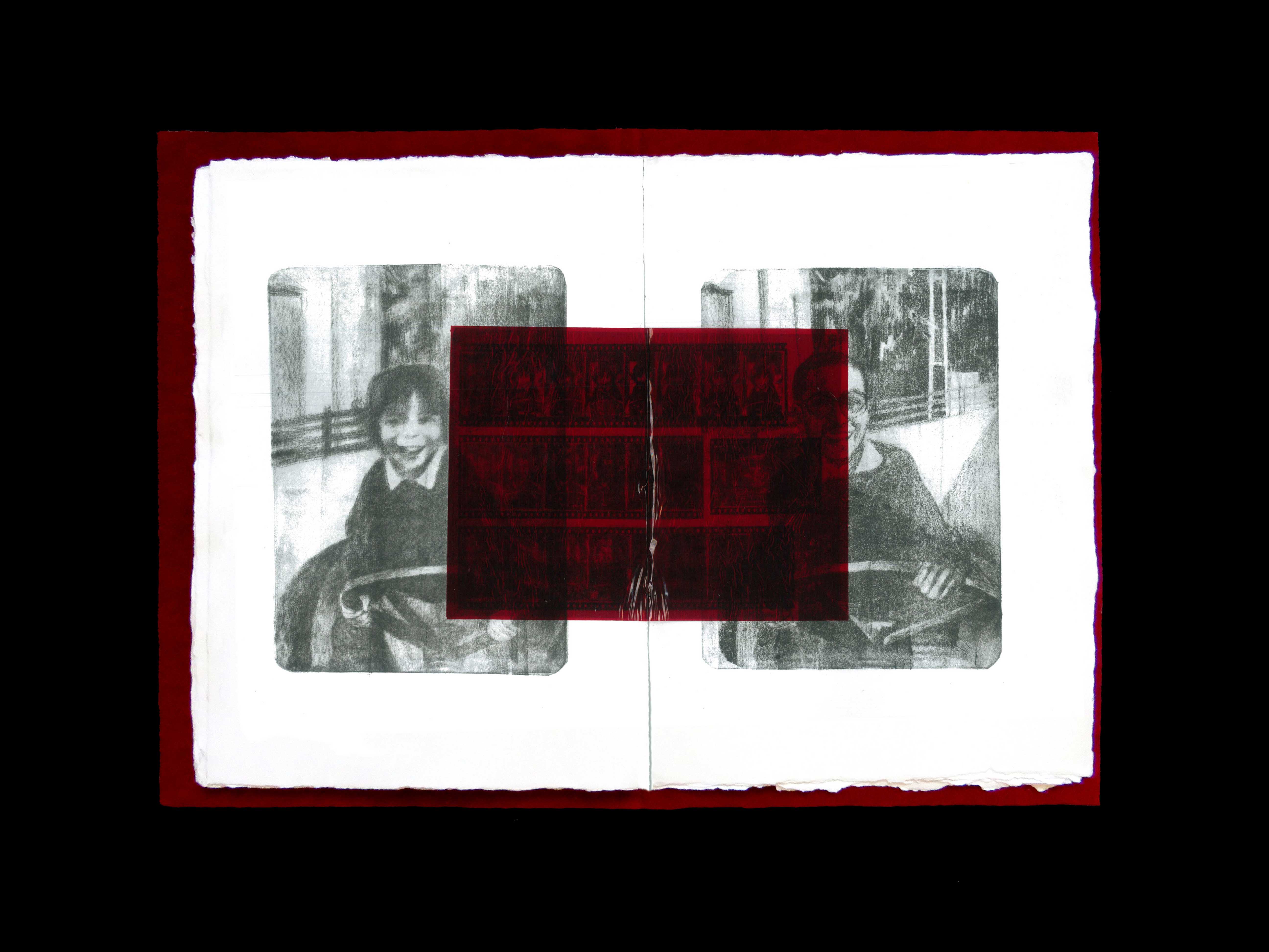
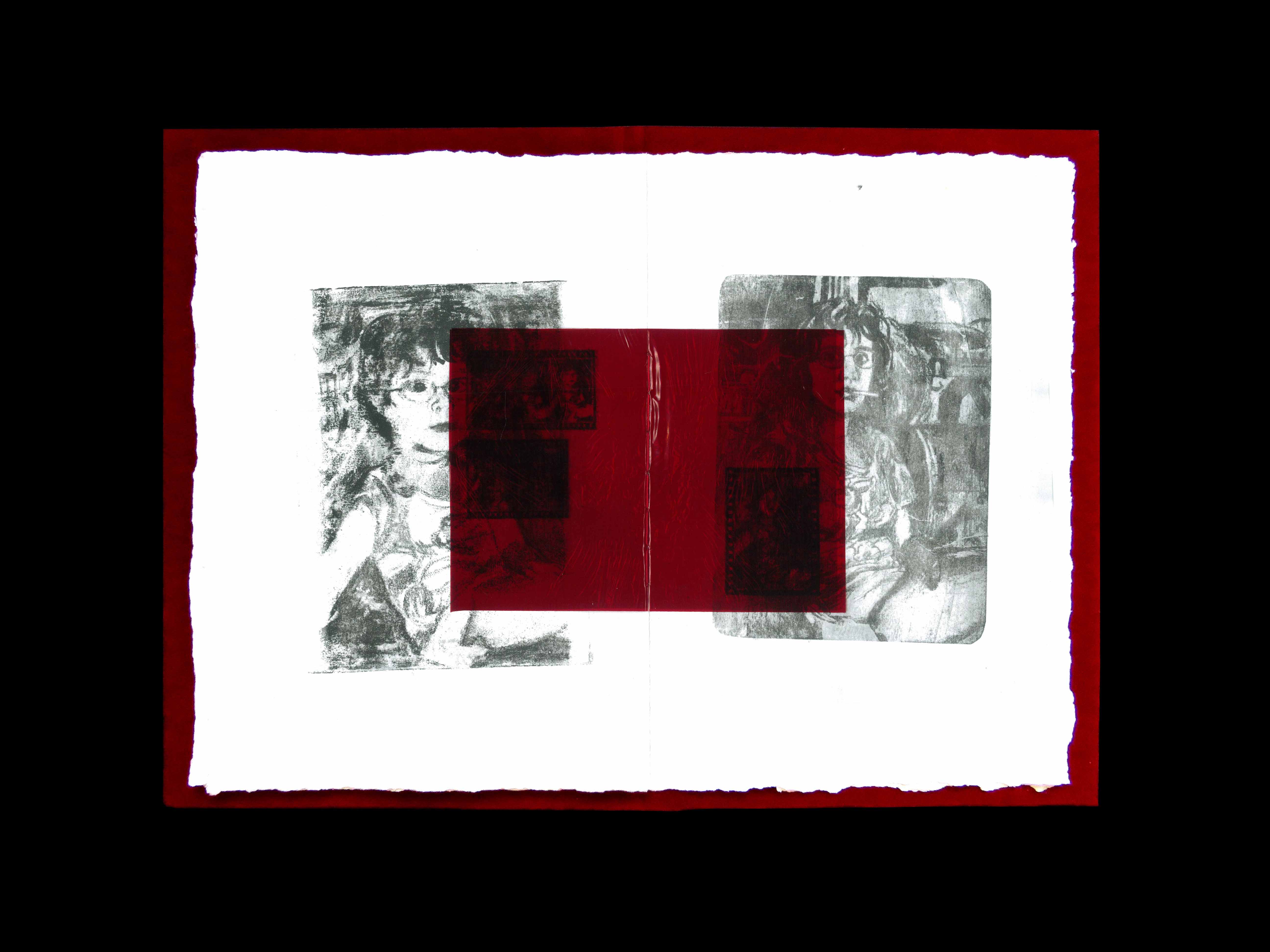
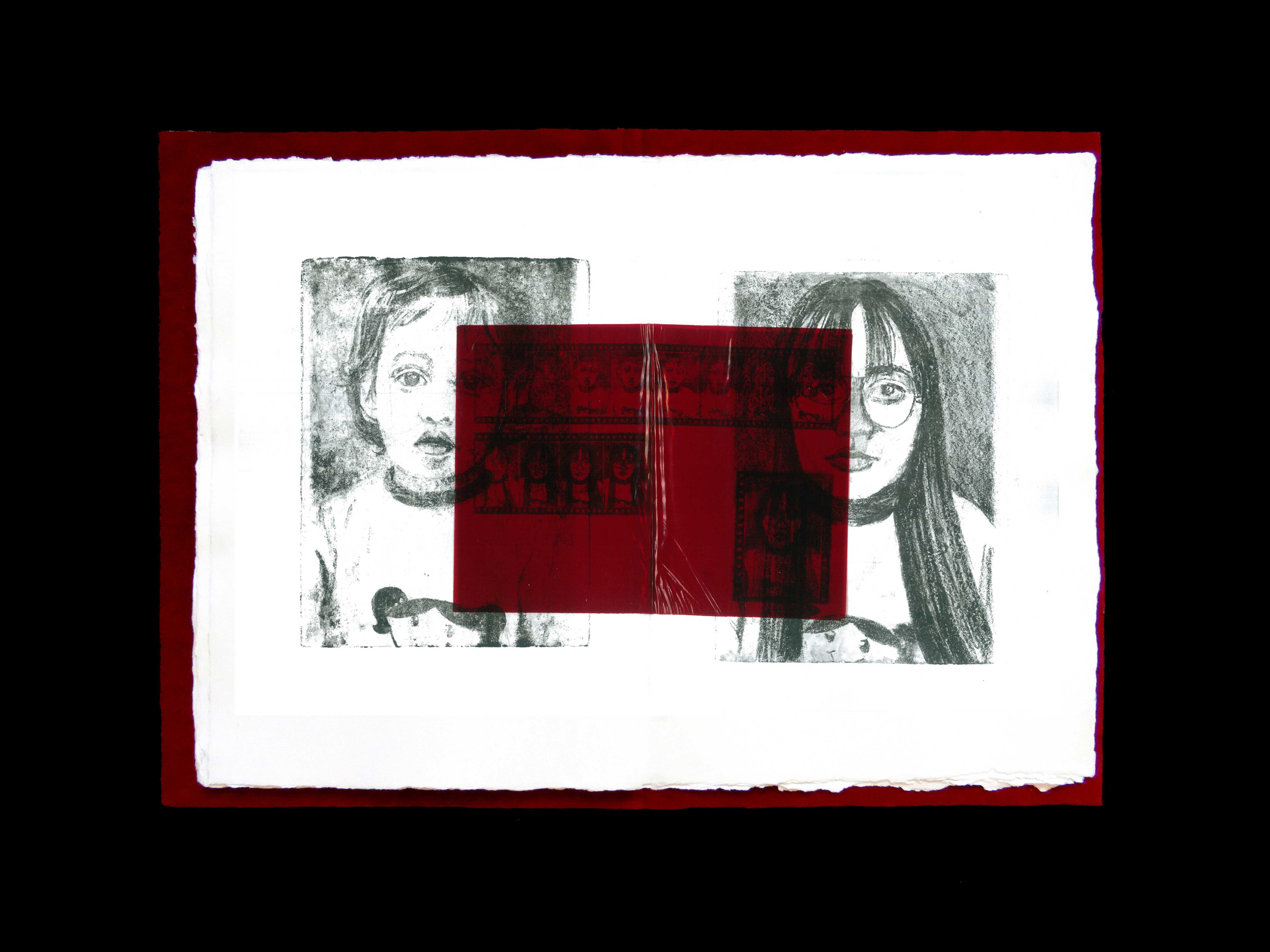
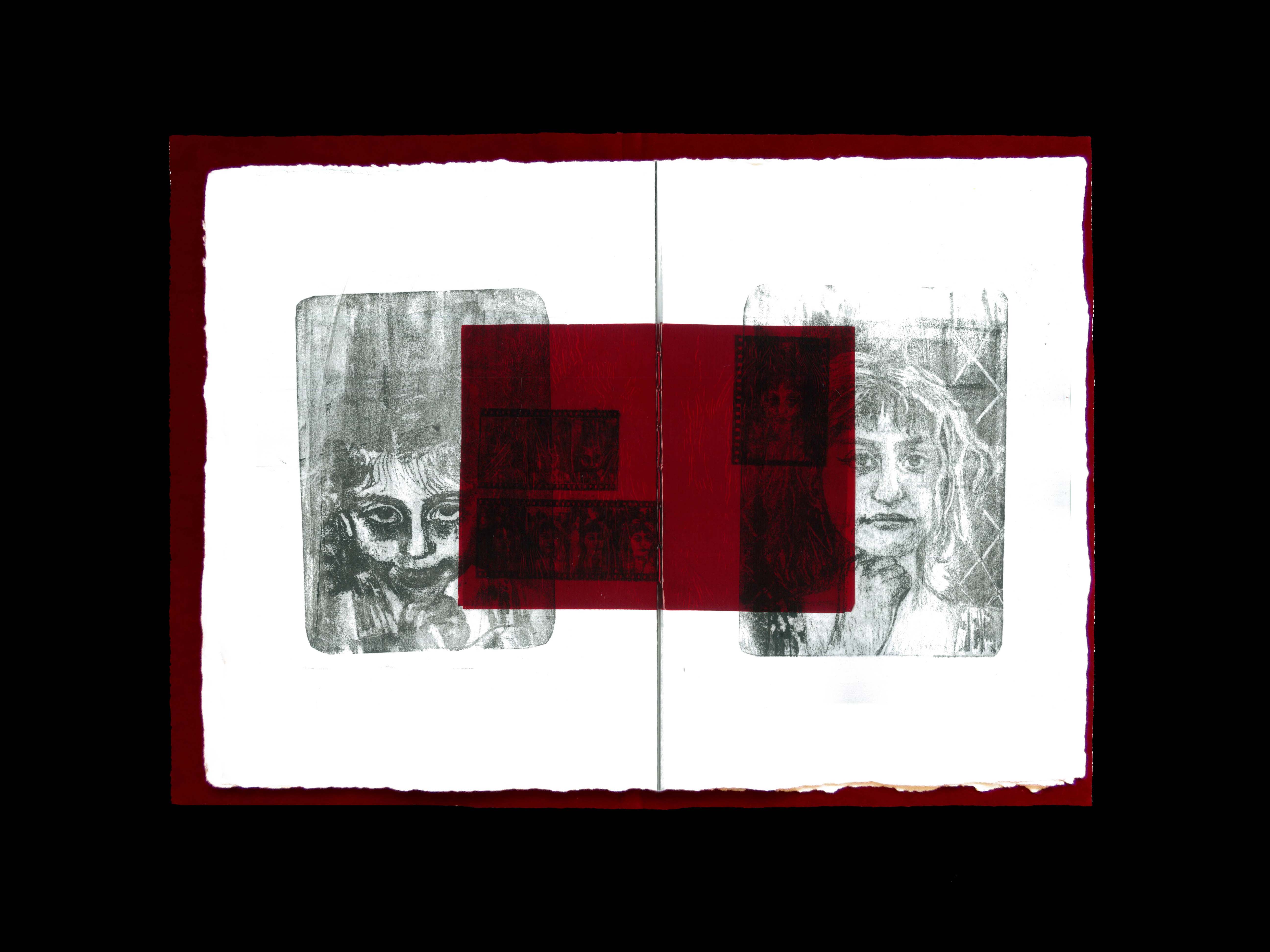
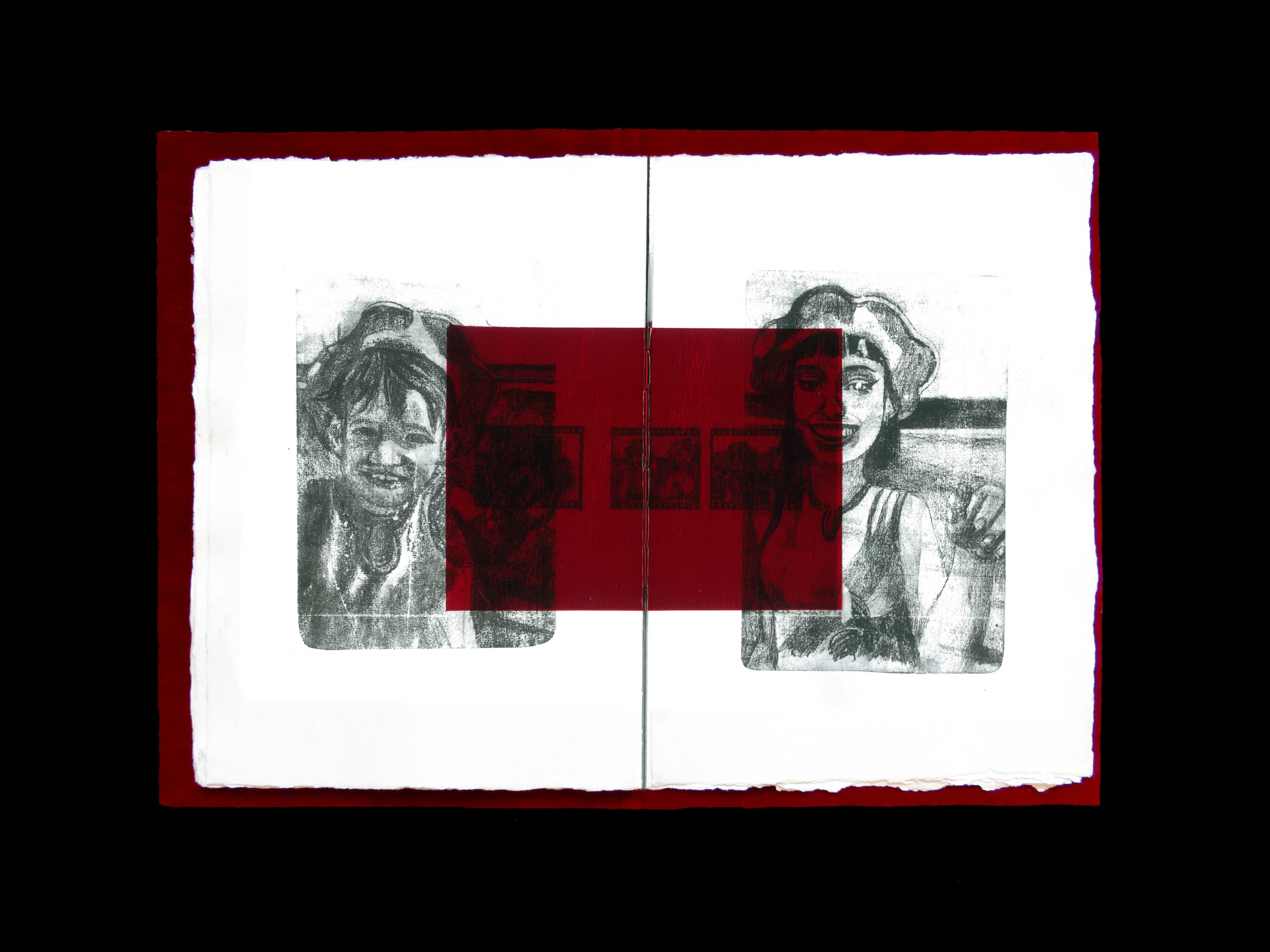
For Marta, Design reflects her aim for perfection but an unexpected kind of perfection, far from the mathematical ideals achieved by computers and machines but a much more human version of it, a version of ancient almost mythological perfection, so imposing yet so human and full of little idiosyncrasies, often associated with her preferred techniques and practices like drawing, painting, printmaking, illustration and photography. Mixing and matching these practices she's able to create works that translate the almost lost art of authenticity honesty.

In this honesty Marta explores, in her original work, the reflection of her own memories (raging from special little details of her childhood to moments of a broken conversation she had just yesterday). Her work exposes her own experiences in such a way that those become universal to all of us.


Experience

Jan 2022
~ present

Freelance Graphic/
Editorial Designer

Jan 2024
Jul 2024

Curricular Internship
Ana Resende Studio

Abr 2022
May 2022

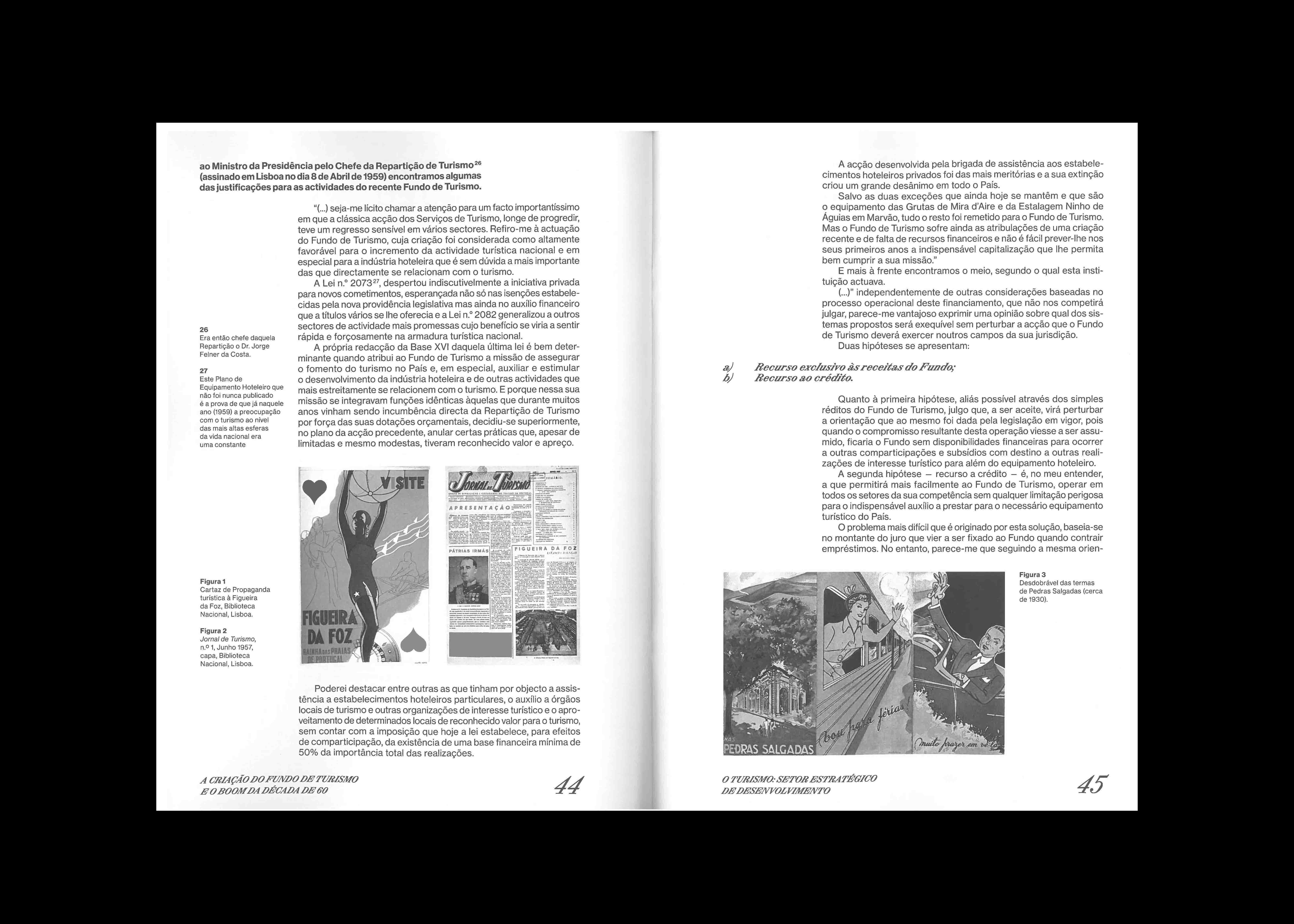
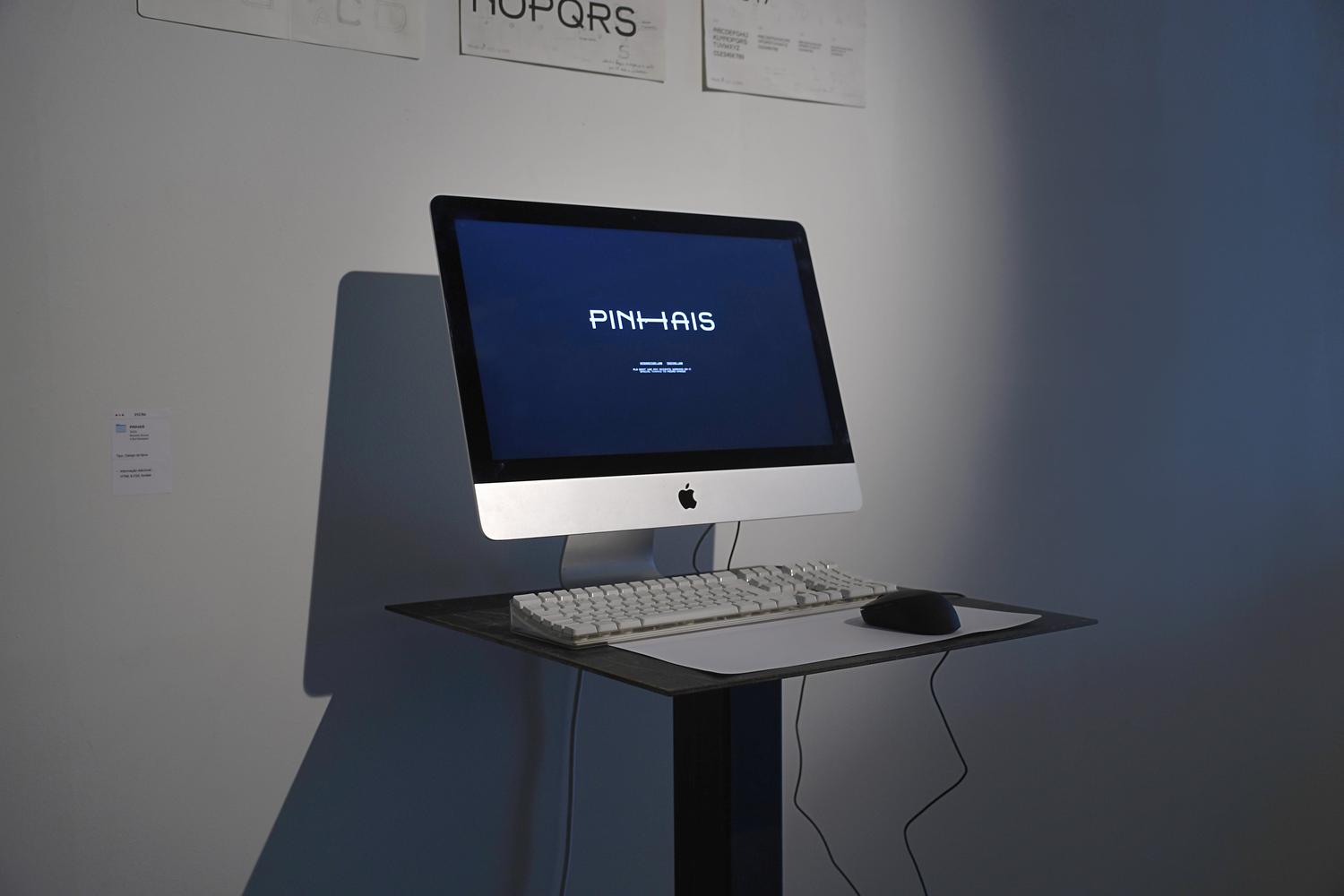
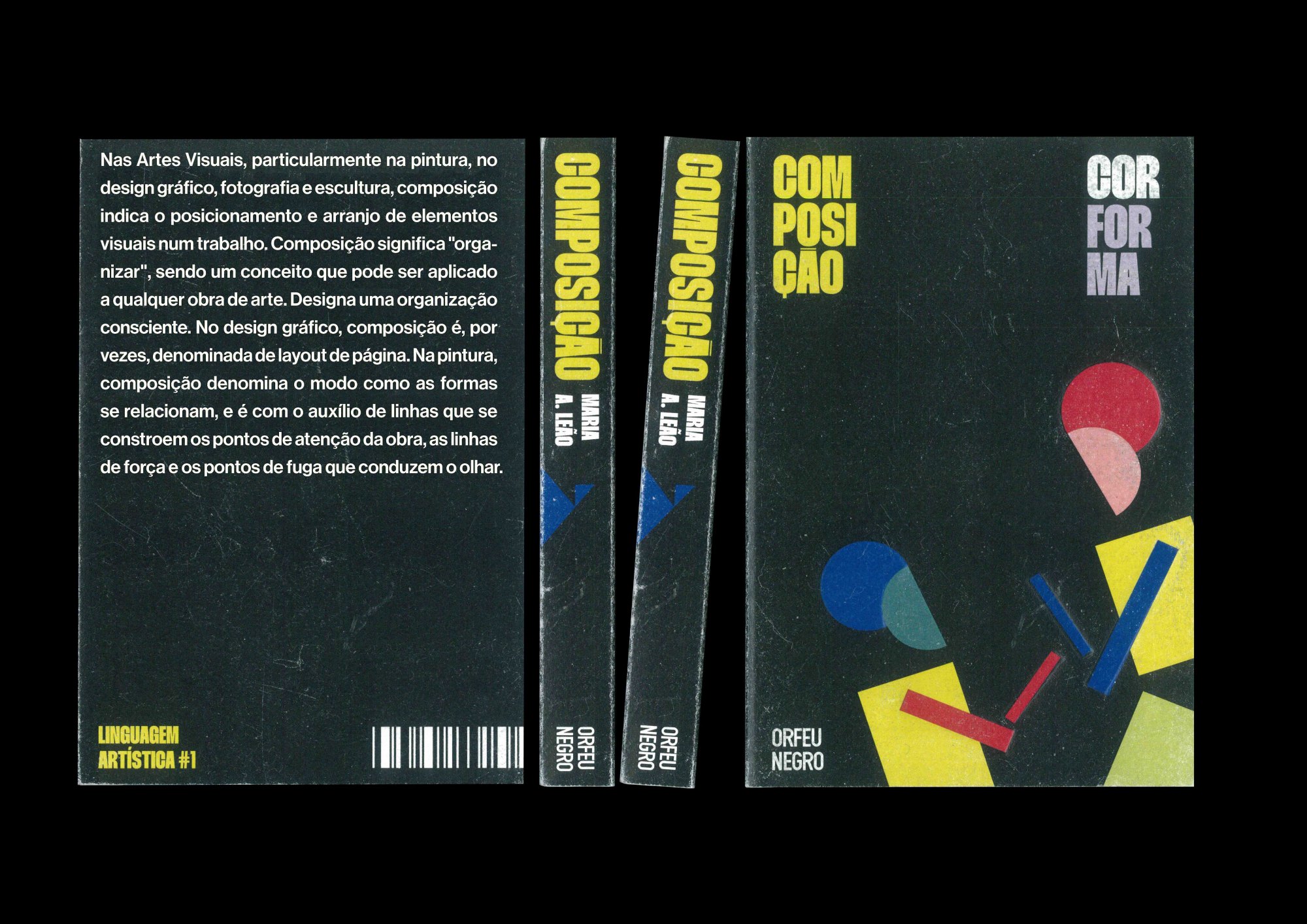
Editorial design of Viana de Lima Prize Catalogue


Education

Oct 2020
Jul 2024

Bachelor Communication Design Faculty of Fine Arts Porto

Oct 2017
Jul 2020

José Estevão High School Aveiro


Awards & Exhibitions

2024

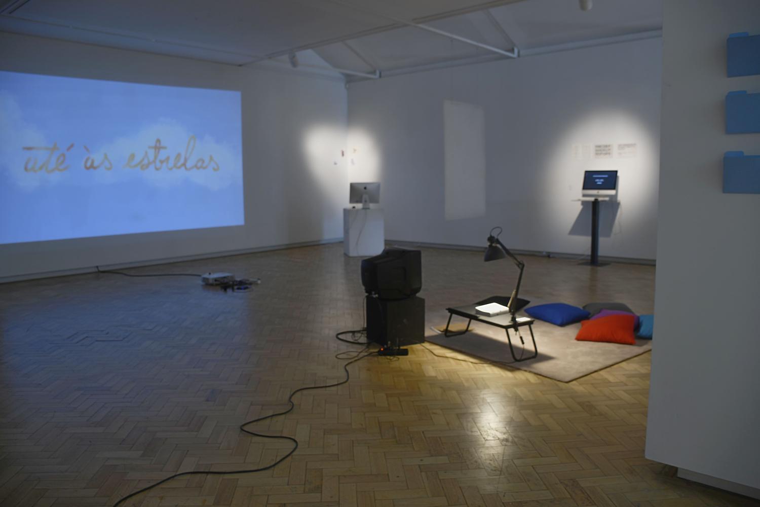
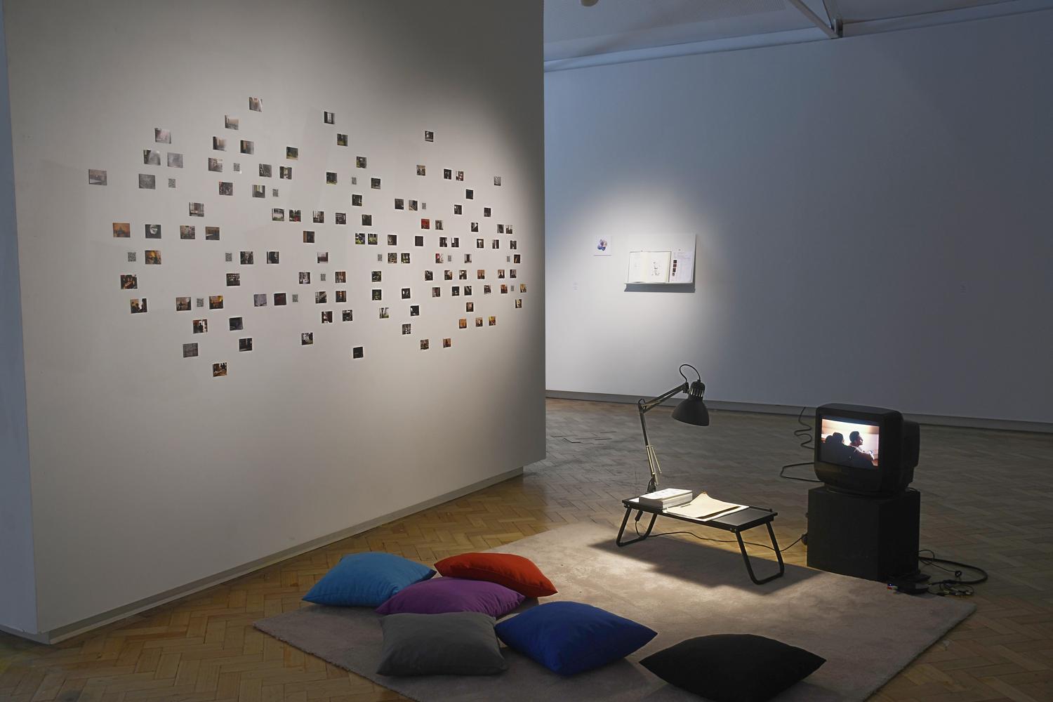
CPLP Biennial Exhibition of Young Creators

2024

Artistic Residency within the scope of the CPLP Young Creators Biennial

2024

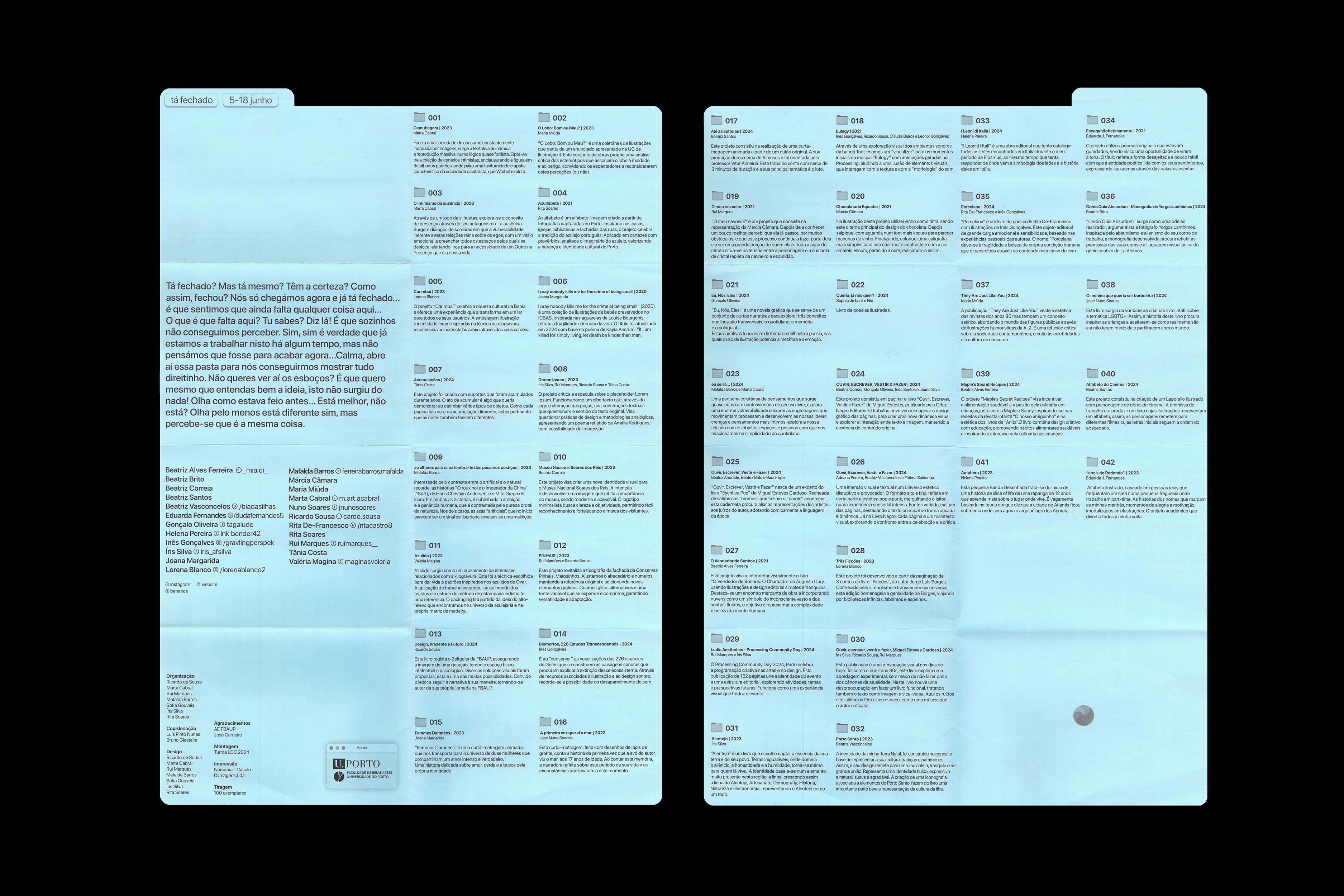
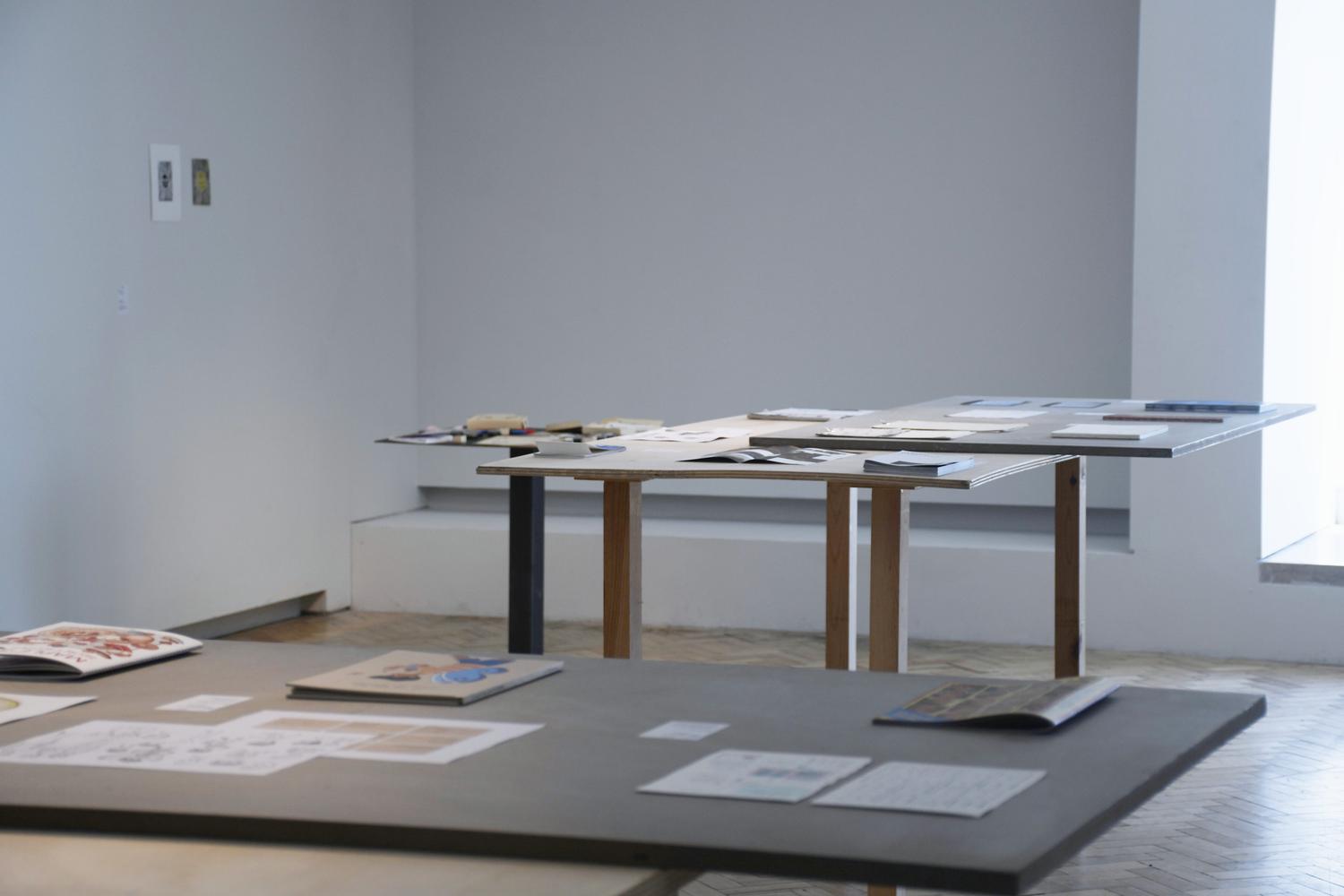
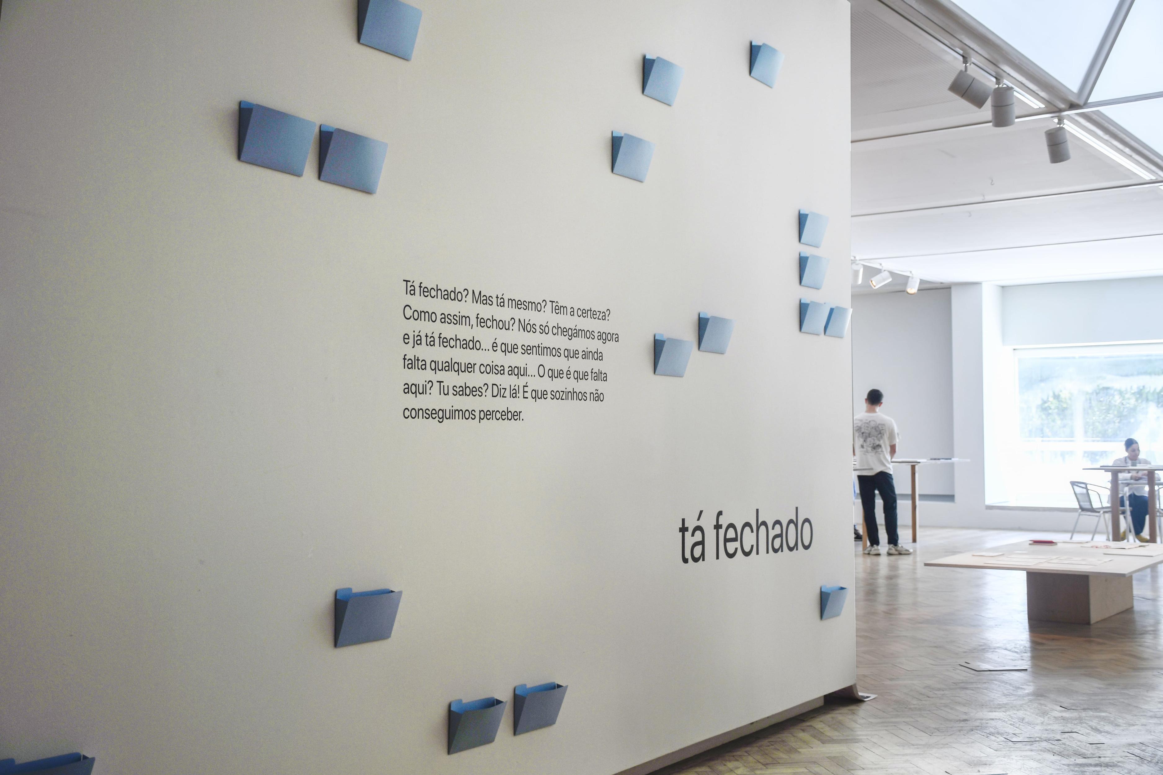
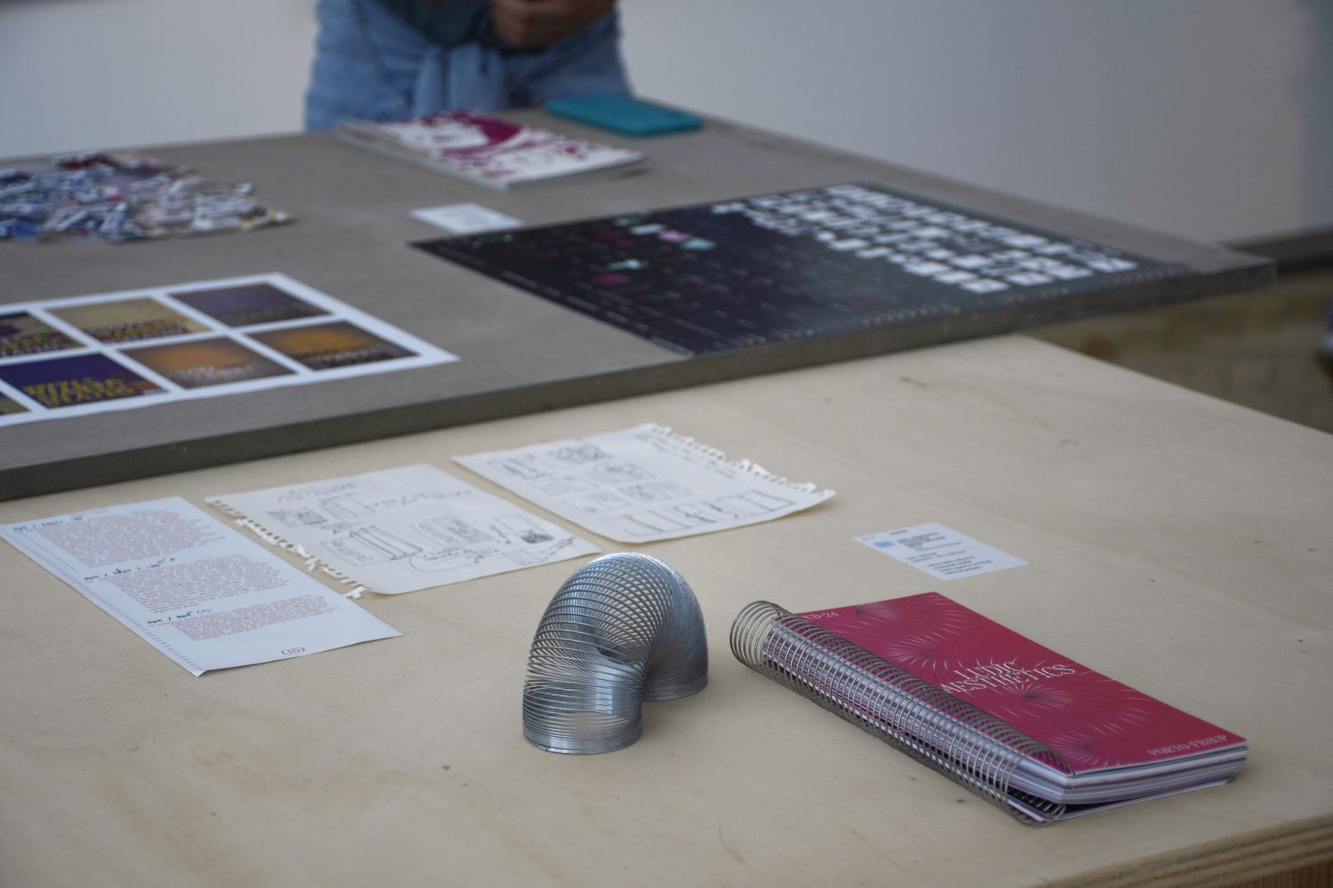
Exhibition of Finalists of the Communication Design Degree “Tá Fechado”

2024

Organizing committee of the “Tá Fechado” Communication Design Degree Finalist Exhibition

2023

“Mostra Nacional Jovens Criadores Gerador”, Youth Hostel of Vila do Conde

2023

Selection “Mostra Nacional Jovens Criadores Gerador”

2023

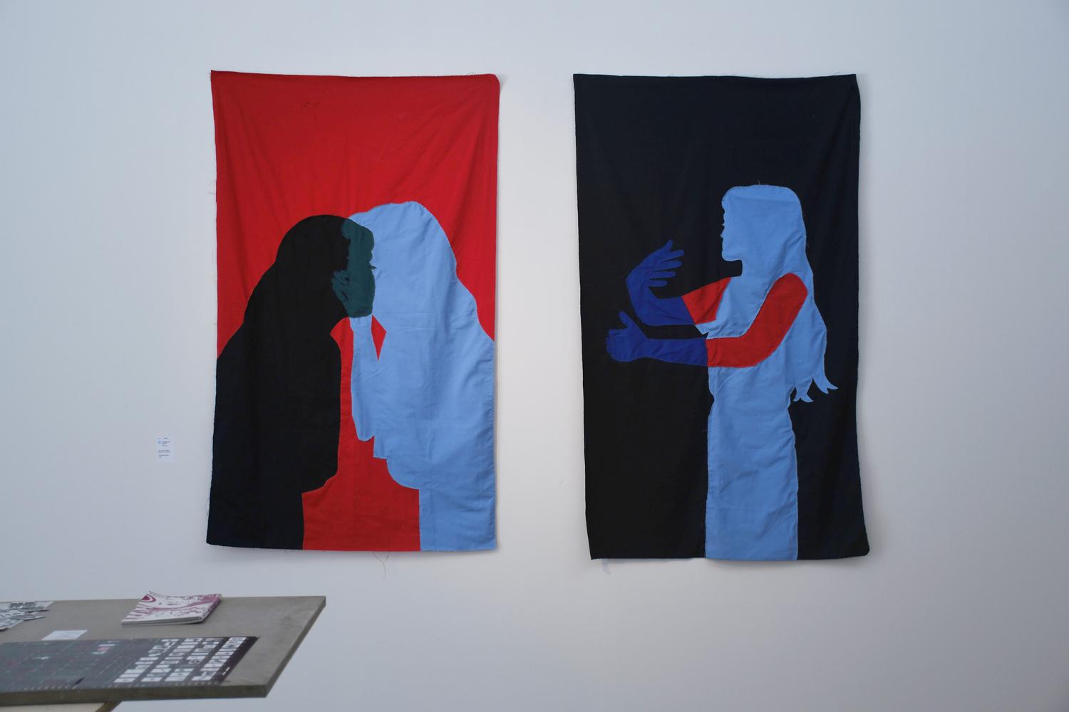
Group show “Intervalo - Antes E Depois, O Desenho”


Workshops

2024

Figma 101 Workshop — FBAUP Design Inc.

2023

Polypropylene Printmaking Workshop — Oficina Mescla

2022

Printmaking Workshop — Jacek Szewczyk and Christopher Nowicki — FBAUP

2021

Drawing and Construction Workshop — João Xará — GrETUA

2020

Character building workshop with Joana Afonso — XS design Xpress


Special Thanks

Space Fictions [2024]

Image Image Image Image Image Image Image Image

Size
148mm × 210mm

Designed by
Ana Resende

Assisted by
Ema Pinto Oliveira
Marta Cabral
Nilza Lello
Rita Constante

Booklets on Architecture and Cinema aims at being a conveyer for a critical and visual approach on both the methodological and narrative connections between architecture and cinema, in the sense that both are acknowledged as artificial apparatuses that effectively allow us to reach and manipulate the fabric of space.

BOOM da Década de 6O [2023]

Image Image Image Image Image Image Image Image

Size
210mm × 297mm

Materials
Munken Pure 90gr
Canson Iris Vivaldi coloured paper 185gr

As a proposal, we were given a chapter from the book “Creation of the Tourism Fund and the Boom of the 1960s - Tourism as a Development Strategy” and asked to develop a magazine in black and white only, in A4 format in the “Swiss” style. The aim of this publication is to evoke the graphic minimalism of this era, stripping it of any visual futility.

[UP]arte [2021]

Image Image Image Image Image Image Image Image Image Image

Size
185mm × 297mm

With
Bernardo Xavier
José Roseiro
Kevin Cunha
Matilde Ferreira
Ricardo Figueiredo

Materials
Offset matte recycled paper 90gr
Offset matte recycled paper 250g

[UP]ARTE is a periodic publication done in paper from AE FBAUP born launched five numbers in the last 25 years. The magazine gives a voice students and teachers from FBAUP, regardless of its format and theme. The only criteria for the work to be published is its direct relationship with the artistic practices.

🌀 Aveiro [2023]

Image Image Image Image Image Image

Size
185mm × 297mm

With
Mafalda Barros

Materials
Munken Pure 90gr
Ultramarine Canson Iris Vivaldi coloured paper 185gr

For this project, the brief was to capture the essence of a territory through a logo and a concept book. The city chosen was Aveiro, with its traditional moliceiros and art nouveau buildings. The book is the result of a combination of analog photographs of the city taken by us and accompanying quotes, presenting the visual identity developed with its entire iconographic system.

🐑 Viana de Lima [2022]

Image Image Image Image Image Image Image Image Image Image

Size
148mm × 210mm

Materials
Munken Lynx 90gr
Munken Lynx 240gr

Freelance catalog for the commemoration of the 10th anniversary of the Viana de Lima prize, awarded by the Esposende City Council. Coordinated by Professor Domingos Loureiro and architect Paulo Guerreiro, the editorial design is inspired by the architecture of Viana de Lima, an influential forerunner of modernist architecture in Portugal, with strong references to Le Corbusier.

🏃 Tá Fechado [2024]

Image Image Image Image Image Image Image Image Image Image Image Image Image

With
Íris Silva
Mafalda Barros
Ricardo Sousa
Rita Soares
Rui Marques
Sofia Gouveia

Materials
Exhibition Leaflet
Entrance Wall
Poster
Social Media

This project was developed for the 2024 Finalists Exhibition for the Communication Design Degree at FBAUP. The exhibition celebrated the end of a cycle and its “archiving”. Having “the process” as the main theme we wanted to highlight a part of the work that is sometimes overlooked, but which is often the most important, as it reveals the true essence of the project. This year's distinguishing feature is the inclusion of the digital environment. These elements were chosen because this class was the first to enter the design world during the Covid-19 pandemic, and their first contact with university life was through a screen.

Lapse in Time [2022]

Image Image Image Image Image Image Image Image Image Image

Size
210mm × 297mm

Materials
Fabriano Rosapina 220gr
Red cellophane 30gr
Bordeaux Velvet Sadipal Paper

Etymologically, nostalgia derives from the combination of nóstos (νόστος - “reunion”) and ἄλγος (álgos - “pain, suffering”), and can be considered the reencounter of suffering. In most interpersonal relationships, vulnerability arises late in life. This gives rise to a desire to witness the development of identities that are central to my existence. Just like the techniques used, human growth moves away from a simple straight line, being quite wandering, with a large interlude between these two instants.

👁 Eu Sei Lá [2024]

Image Image Image Image Image Image Image Image Image Image Image Image Image Image Image Image Image Image Image Image

Size
120mm × 170mm

With
Mafalda Barros

Materials
Munken Pure 90gr
Papel Roto 250gr

A small collection of thoughts that appears almost like an open-access confessional, explores a vulnerability and exposes the cogs that move, process and develop our most intimate ideas, beliefs and thoughts. It explores our relationship with the objects, spaces and people we relate to in the simplicity of everyday life.

Virgem que pariu [2023]

Image Image Image Image Image Image Image Image Image Image Image Image Image

Size
112mm × 223mm

With
Cláudia Barros
Mafalda Barros
Sofia Gouveia

Materials
Fluorescent Pink Clairefontaine Trophée coloured paper 80gr
Fuchsia Canson Iris Vivaldi coloured paper 185gr

Virgem que pariu seeks to invoke the Madonna Whore complex. An object of study for psychoanalysis, it explores the duality between erotic women (whores, sexually liberated) and chaste women (saints and sexually repressed). In this sense, this publication sets out to associate and oppose antagonistic concepts, deconstructing them. It is made up of paintings by men, fonts drawn by women and definitions from the priberam dictionary.

“Where such men love, they have no desire, and where they desire, they cannot love.” - Sigmund Freud

😱 Linguagem Artística [2022]

Image Image Image Image

Size
145mm × 210mm

Materials
Fabriano Rosapina 220gr

Color refers to the light reflected from objects. Shape is the external appearance of objects. The line describes the shape, and when a line closes it gives rise to a shape. Composition means “to organize”, and is a concept that can be applied to any work of art. With this collection, the aim is to convey these three concepts through the smallest possible graphic elements, while maintaining a coherent line throughout the collection. The bas-relief elements add a focus for the reader's gaze, while also introducing a sensory component.

Alfabelas [2022]

Image Image Image Image Image Image Image Image Image Image Image Image

Size
300mm × 405mm

With
Mafalda Barros

Materials
Munken Pure 90gr
Ultramarine Canson Iris Vivaldi coloured paper 185gr

The aim of this publication is to compose a Roman alphabet using images of spaces at the Faculty of Fine Arts in Porto which, at first glance, bear no resemblance to the Roman alphabet, but which, with a certain framing and an attentive eye, metamorphose into these characters. In this way, an unusual and surprising alphabet is constructed. Analog photography proved to be the most appropriate medium for the project, giving it a certain timelessness. To give this work a greater purpose, we chose to associate it with the celebration of the institution's 250th anniversary.