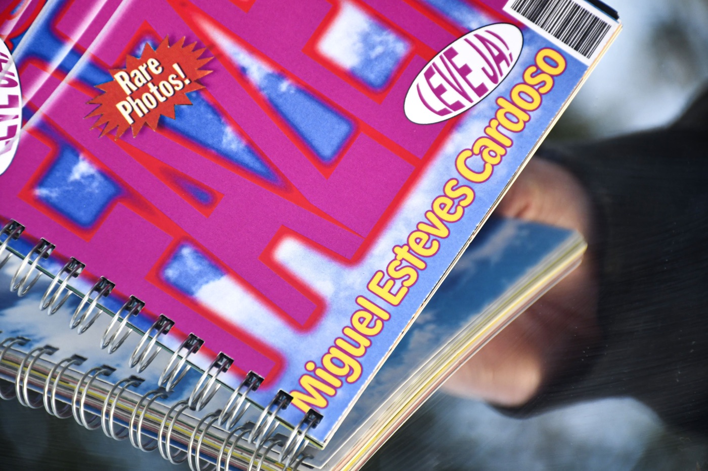
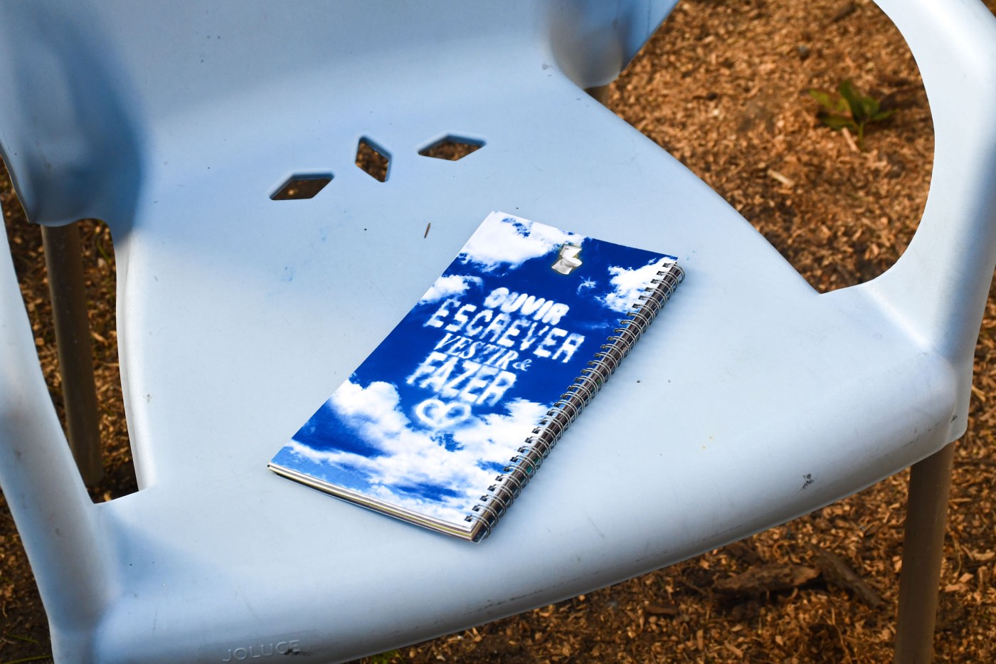
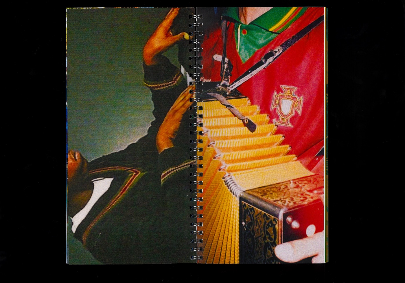
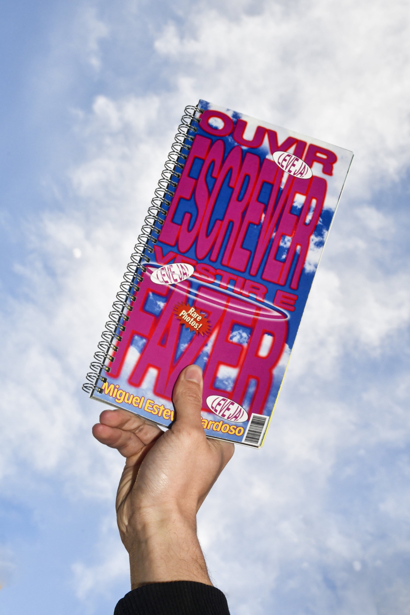
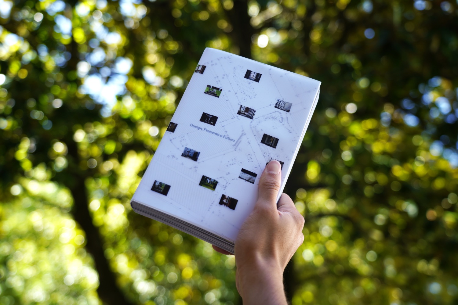
× Design, Presente e Futuro — Editorial Design & Photography [↘]
Duration
Dec 2023 —
Jun 2024
Design
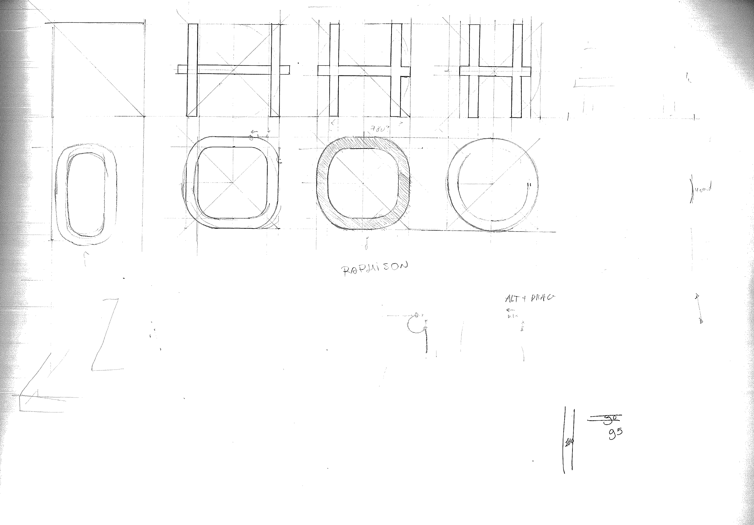
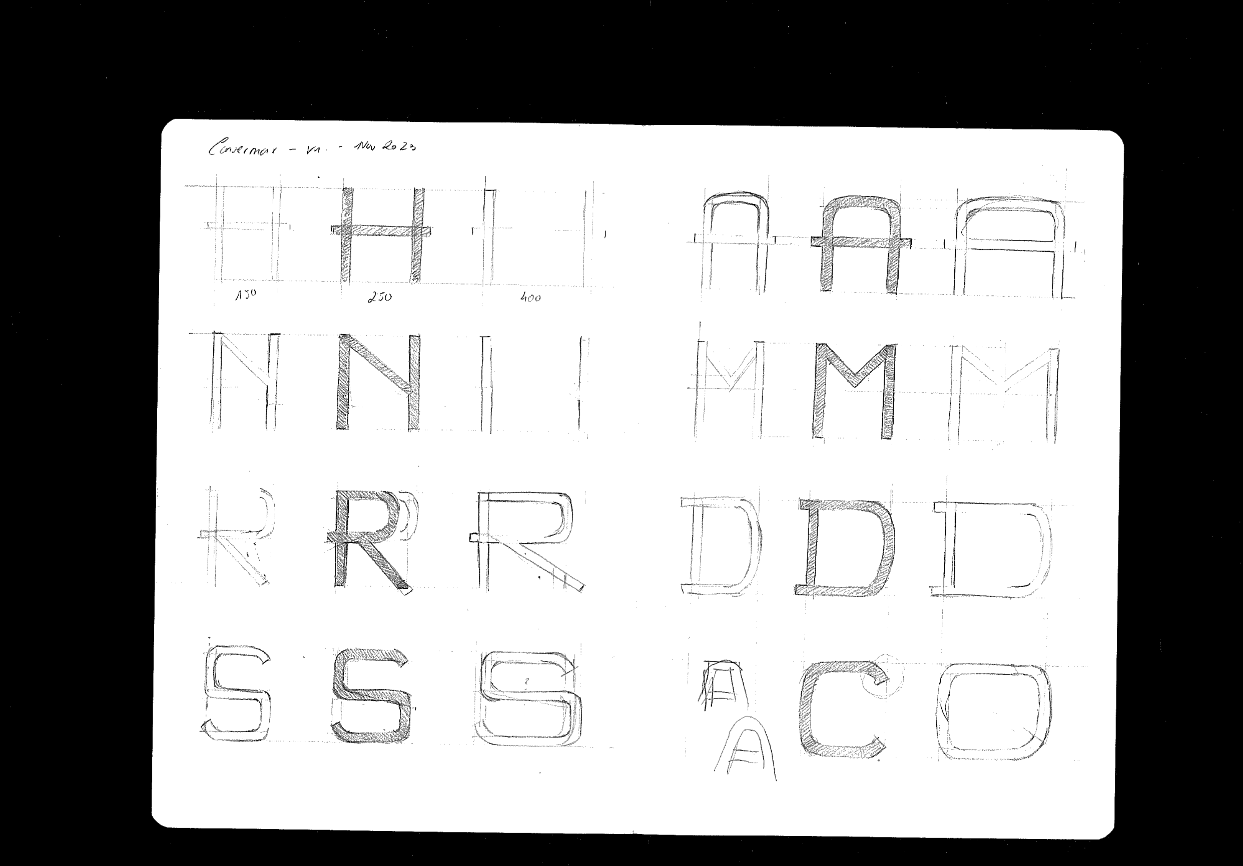
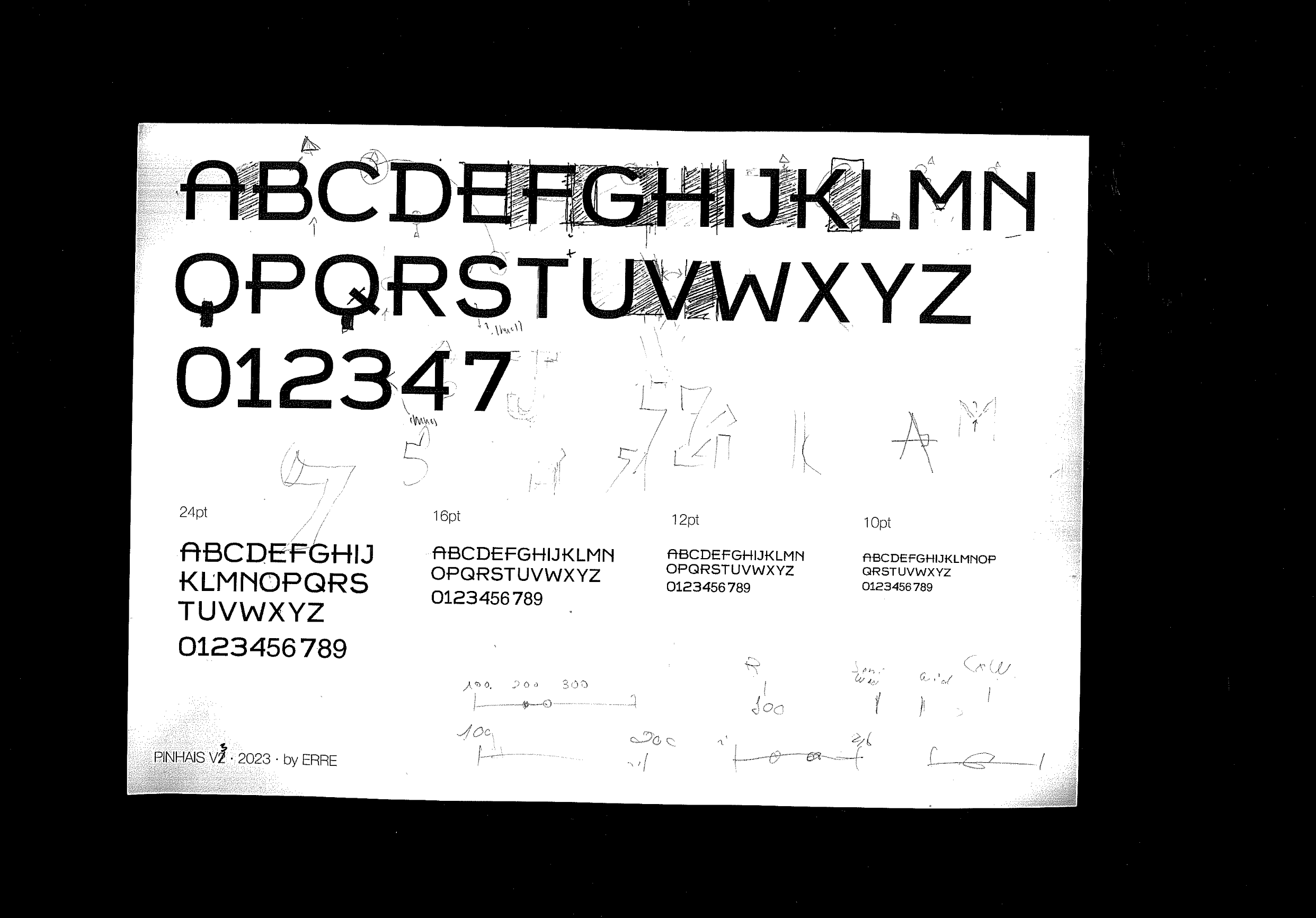
Ricardo Sousa
Photography
Ricardo Sousa
Rui Marques
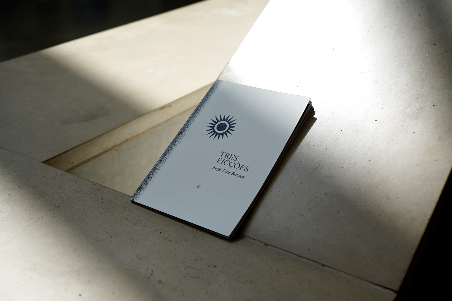
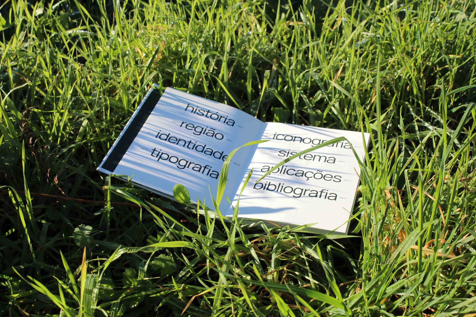
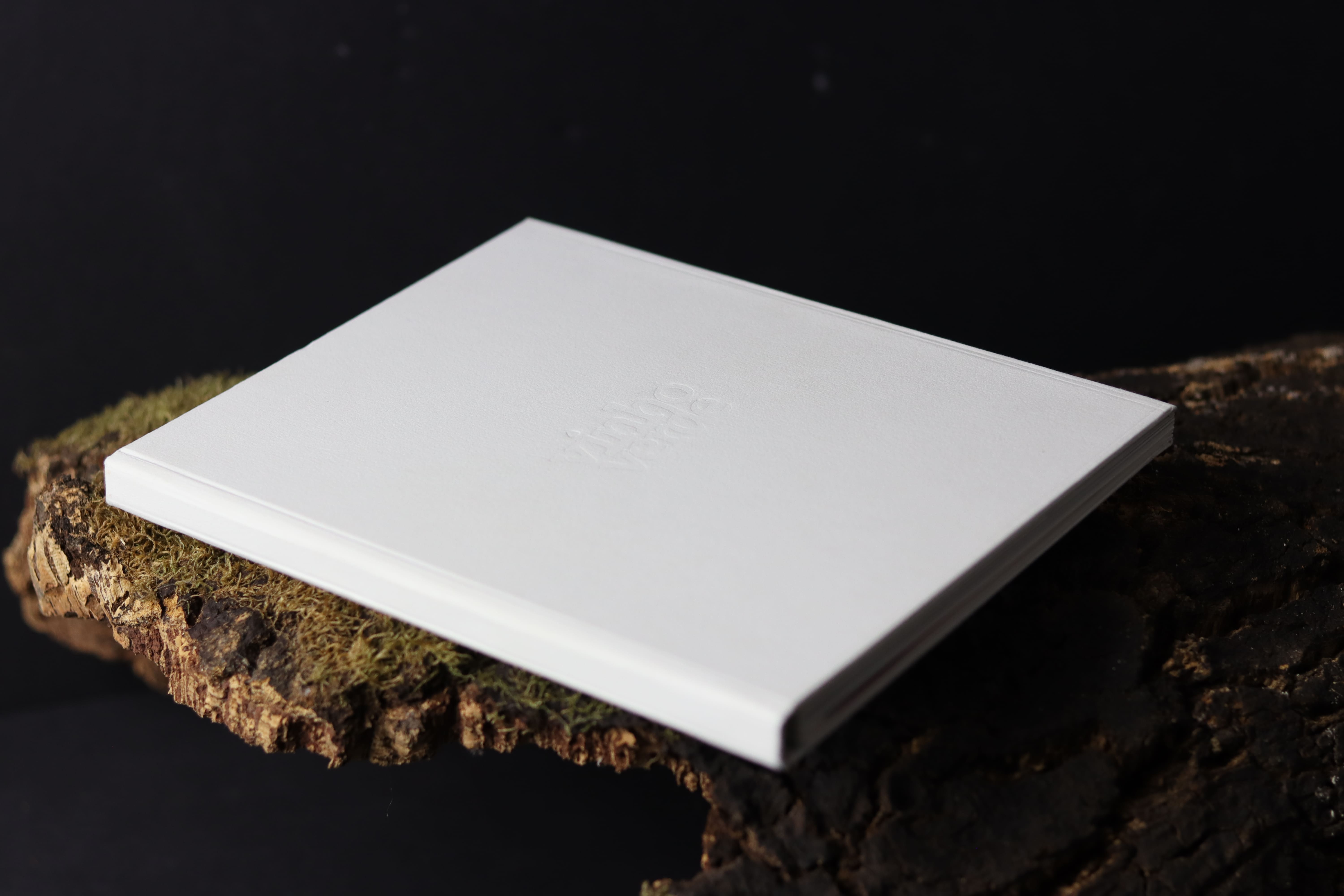
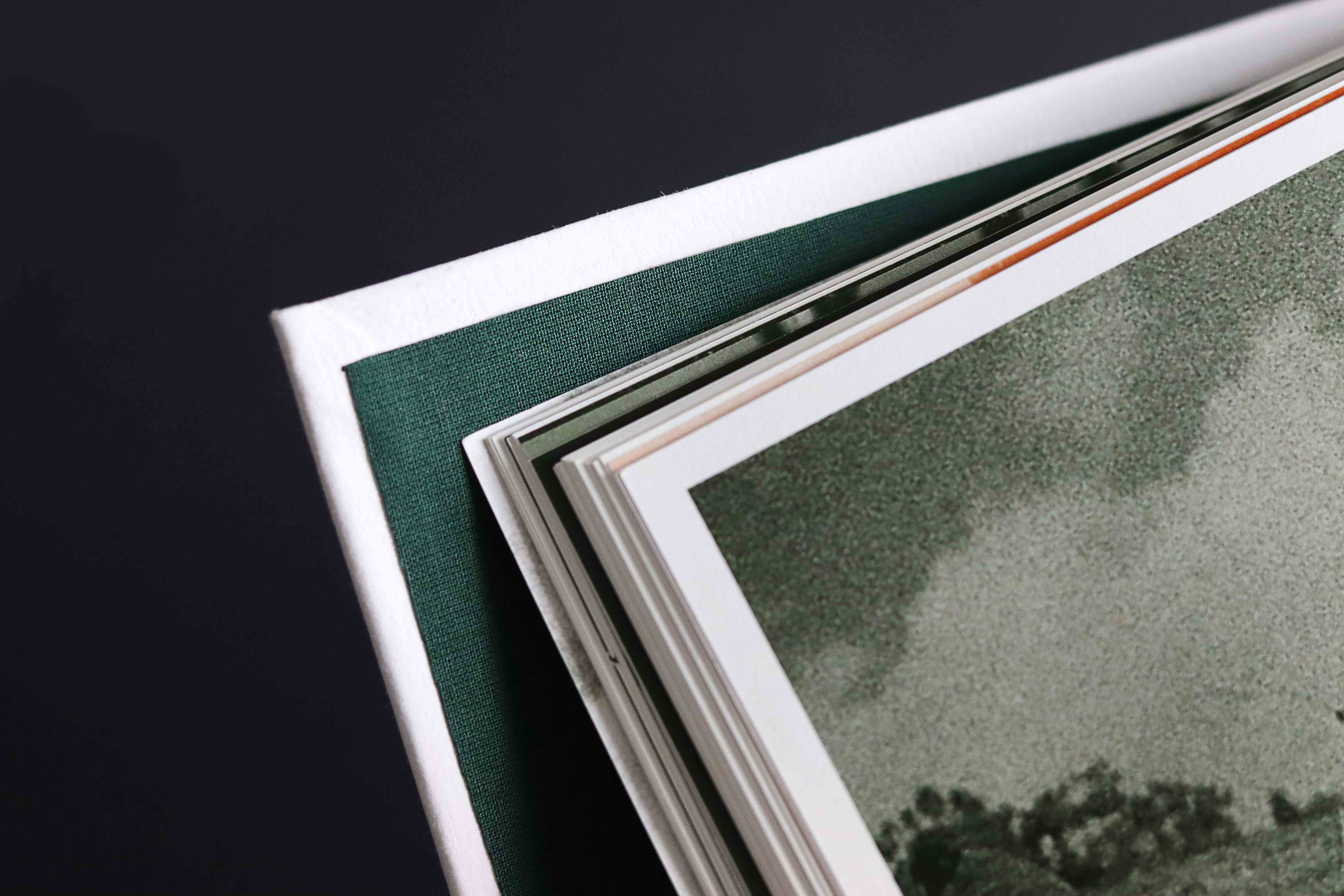
Format
140✕210mm
Texts
Bruno Giesteira
Ricardo Sousa
Vítor Almeida
Soundscape
Consultant
Bruno Giesteira
Mário Moura
Viana Almeida
Acknowledgements
Francisco Modesto
Inês Nepomuceno
Joana Pestana
Luis Cepa
Mário Roda
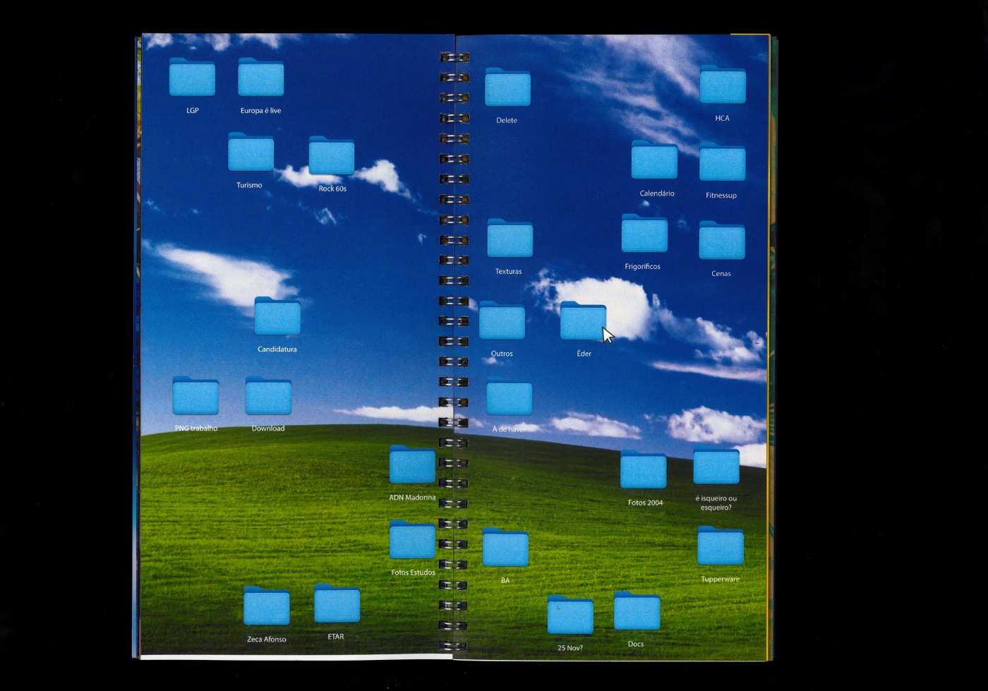
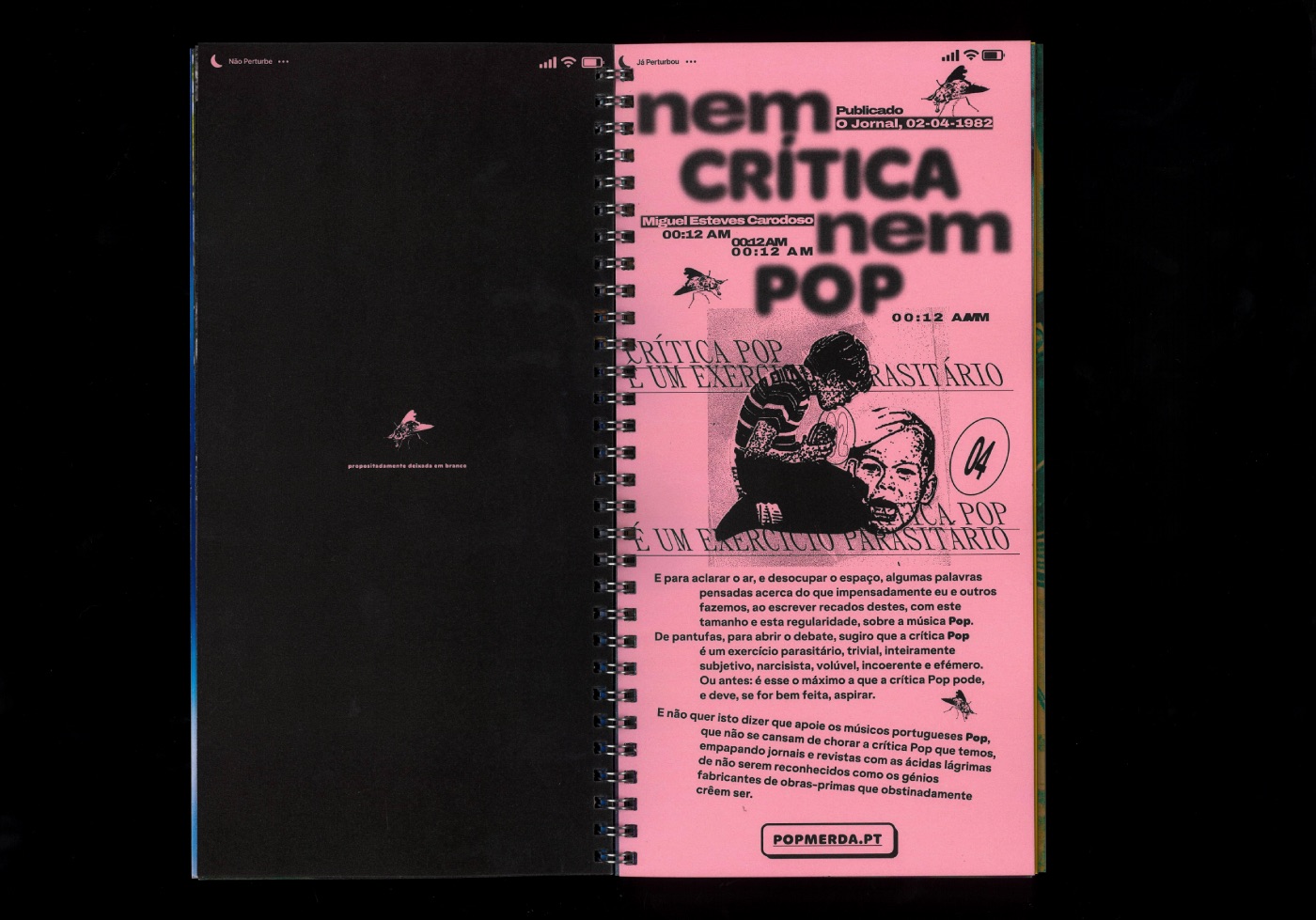
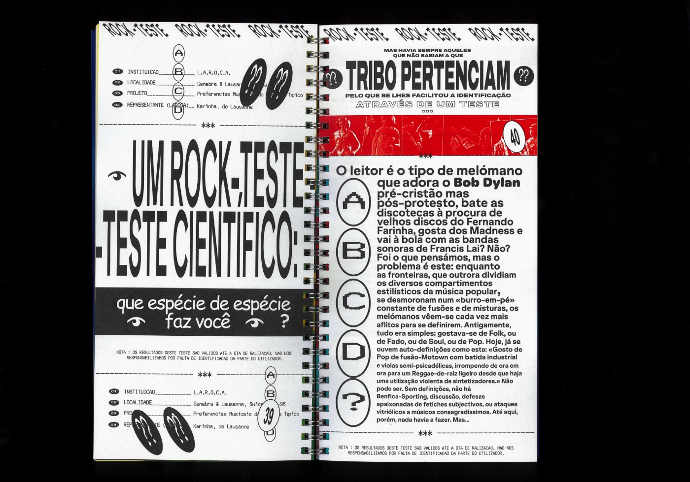
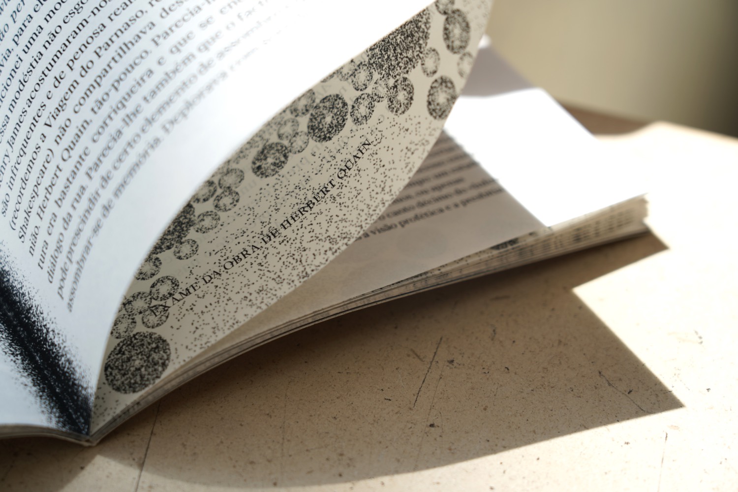
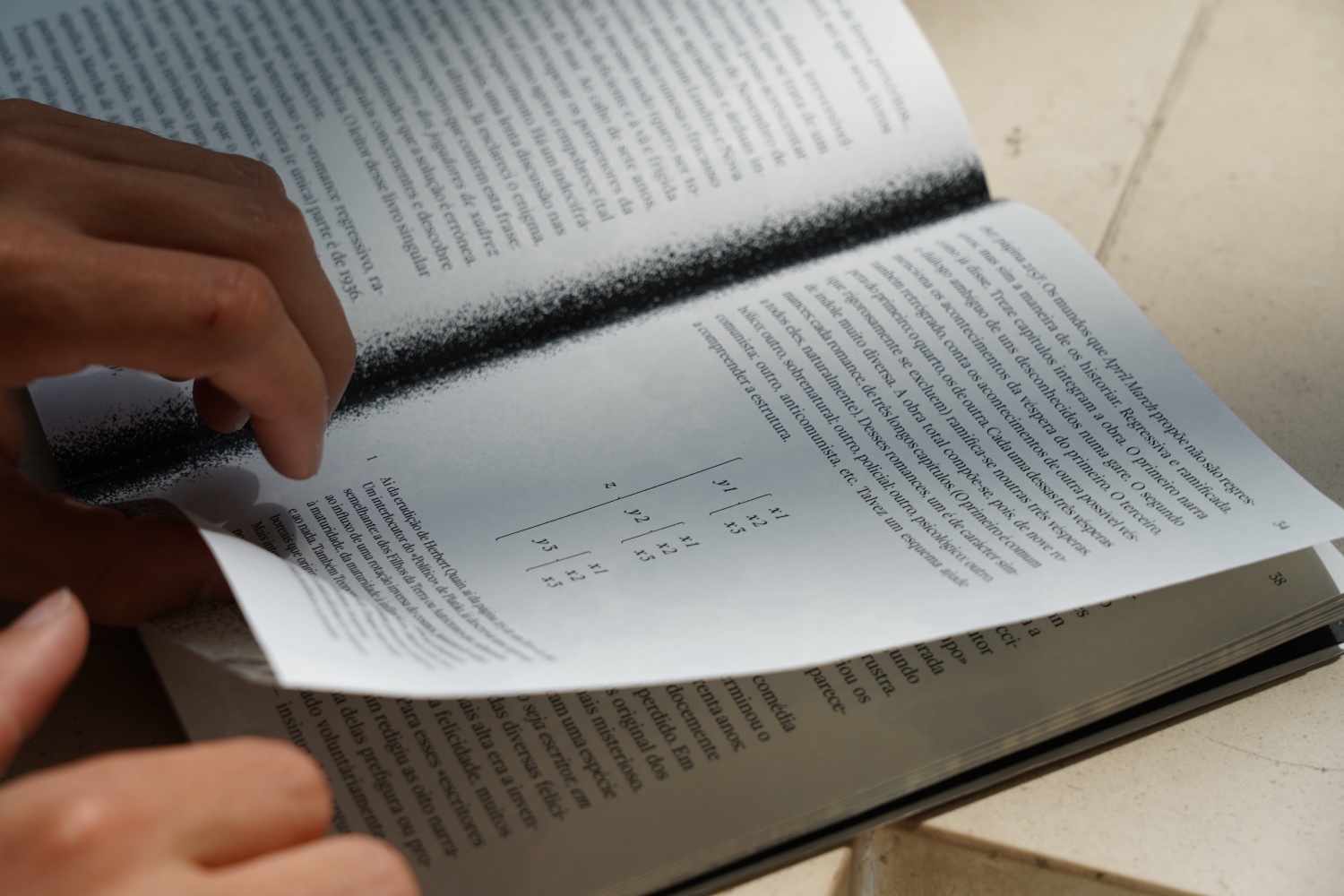
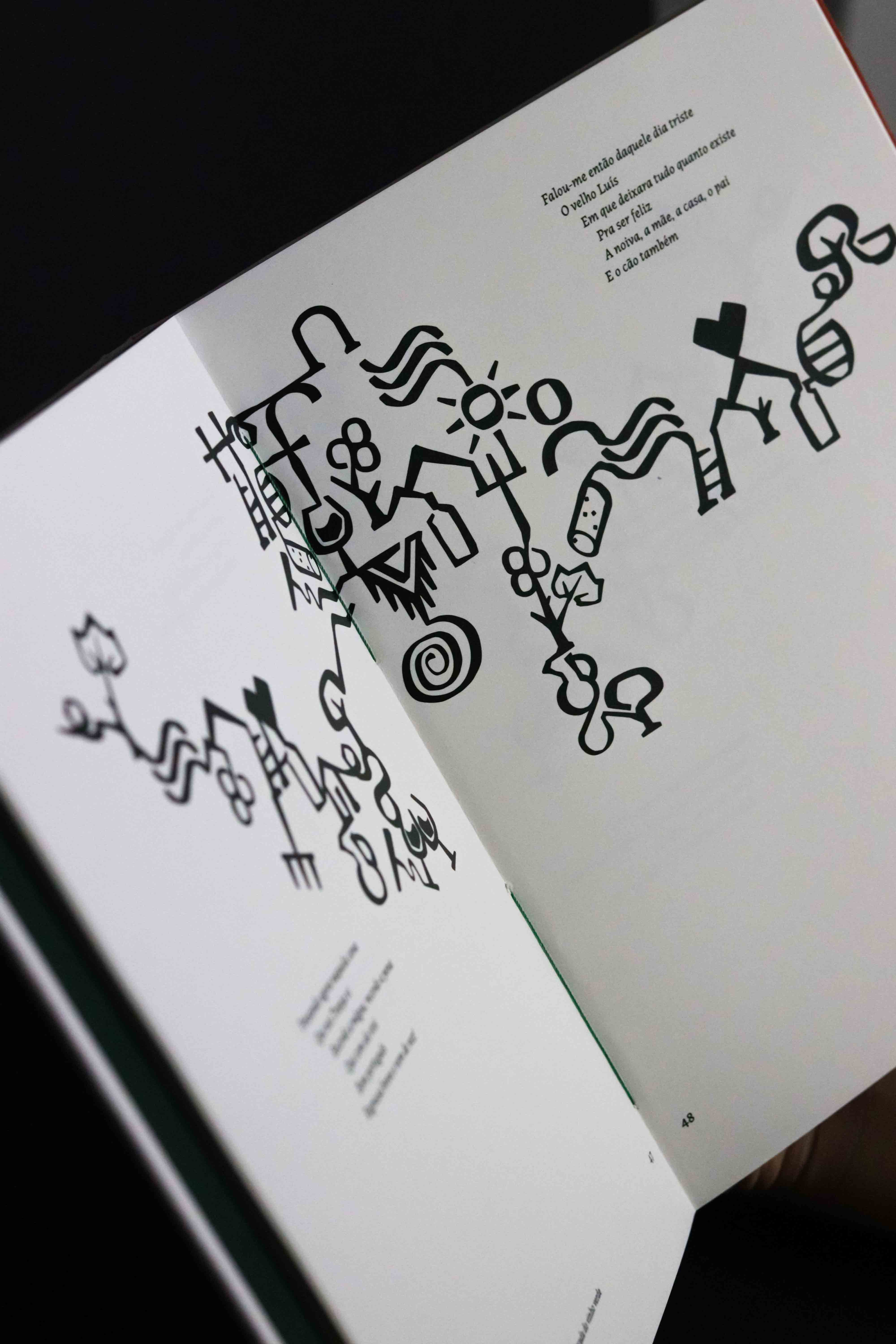
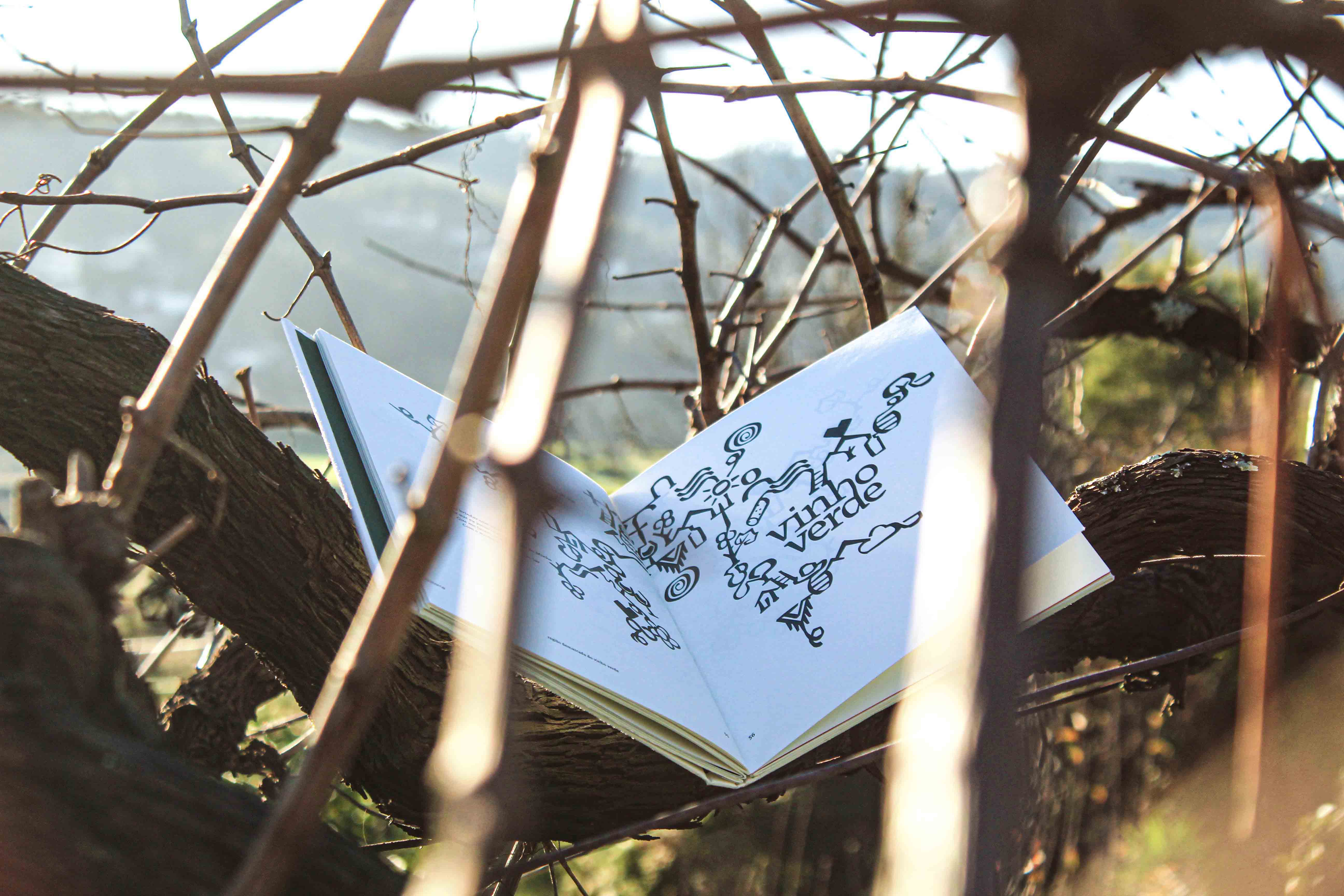
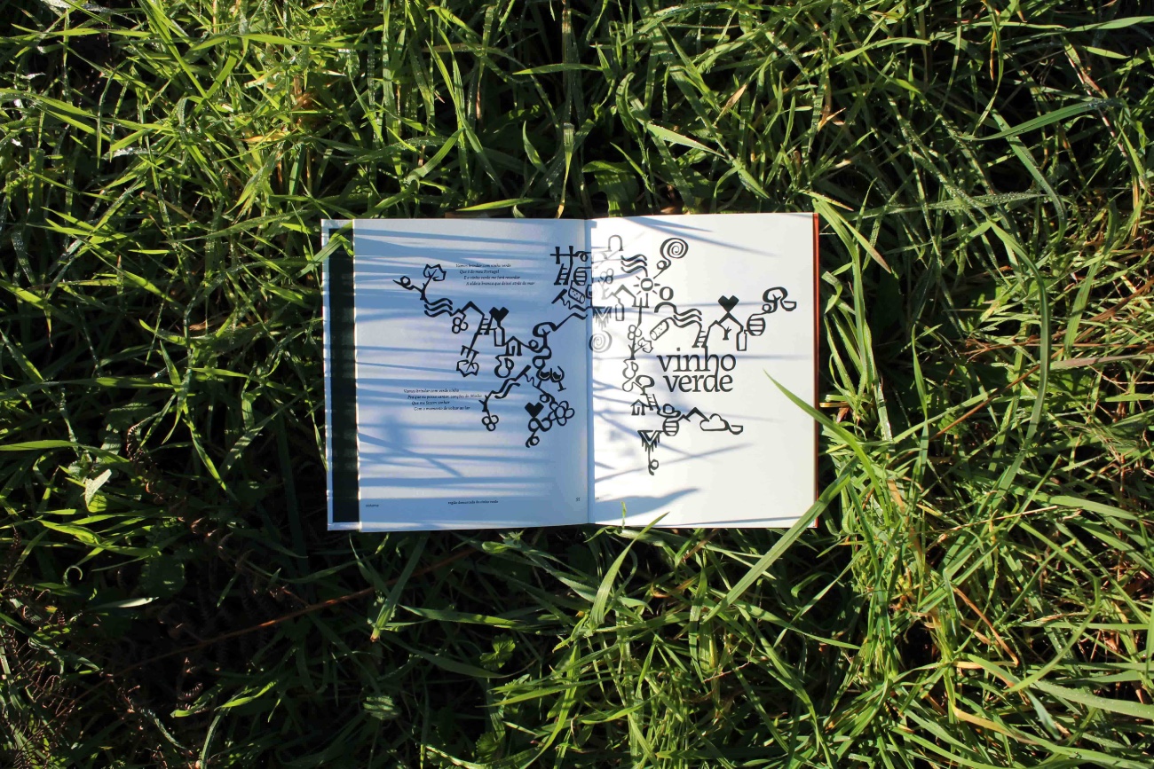
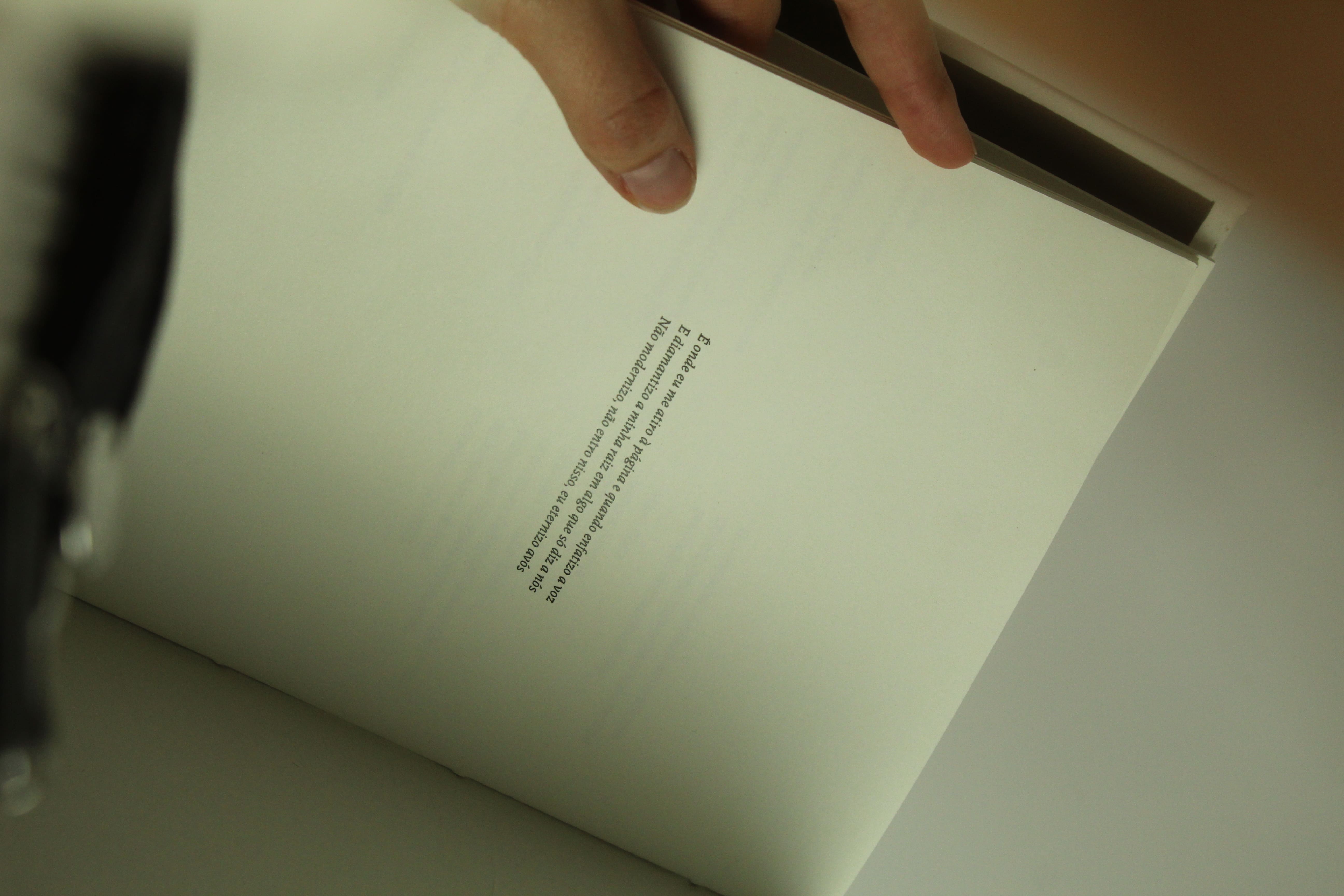
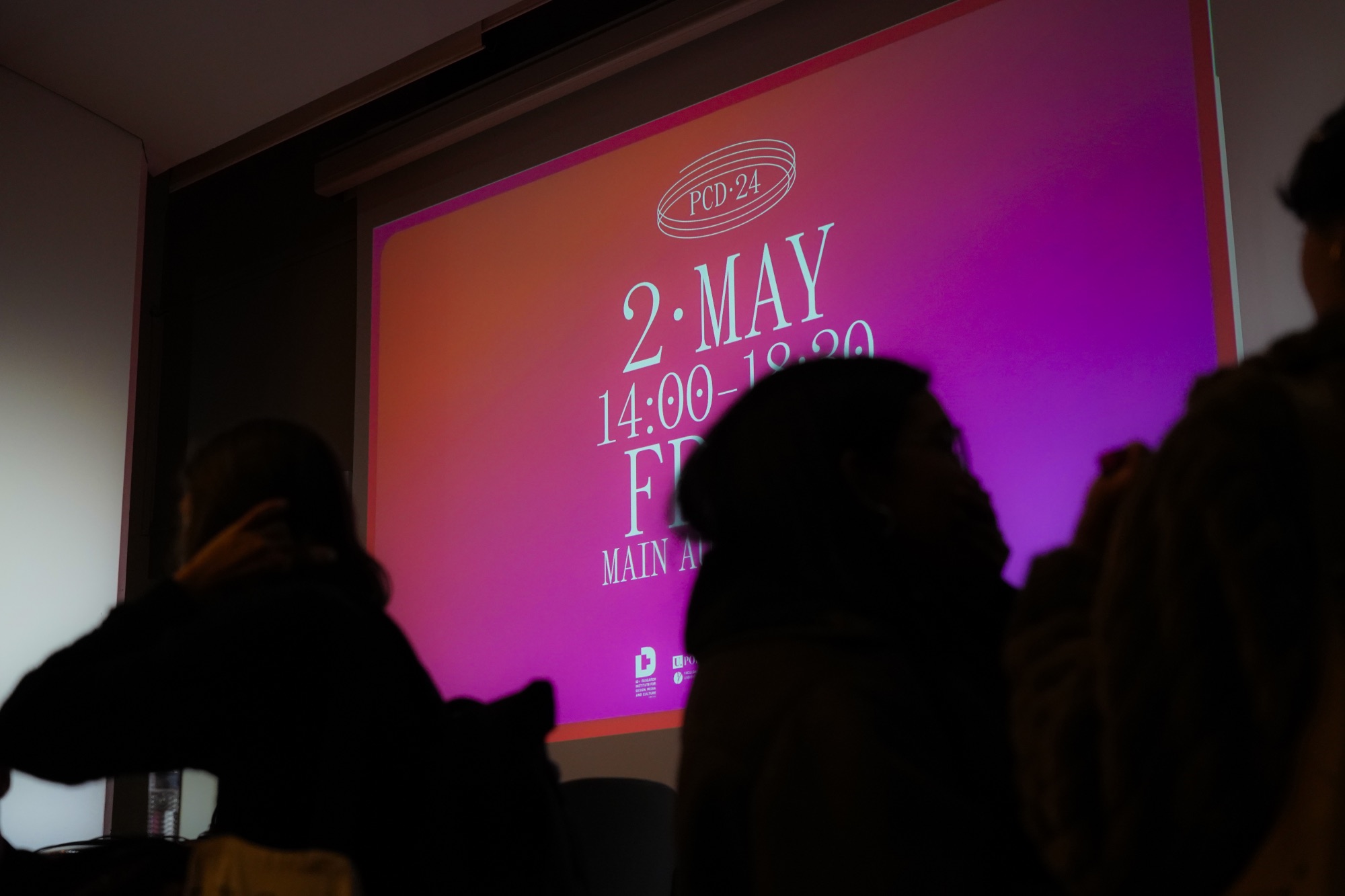
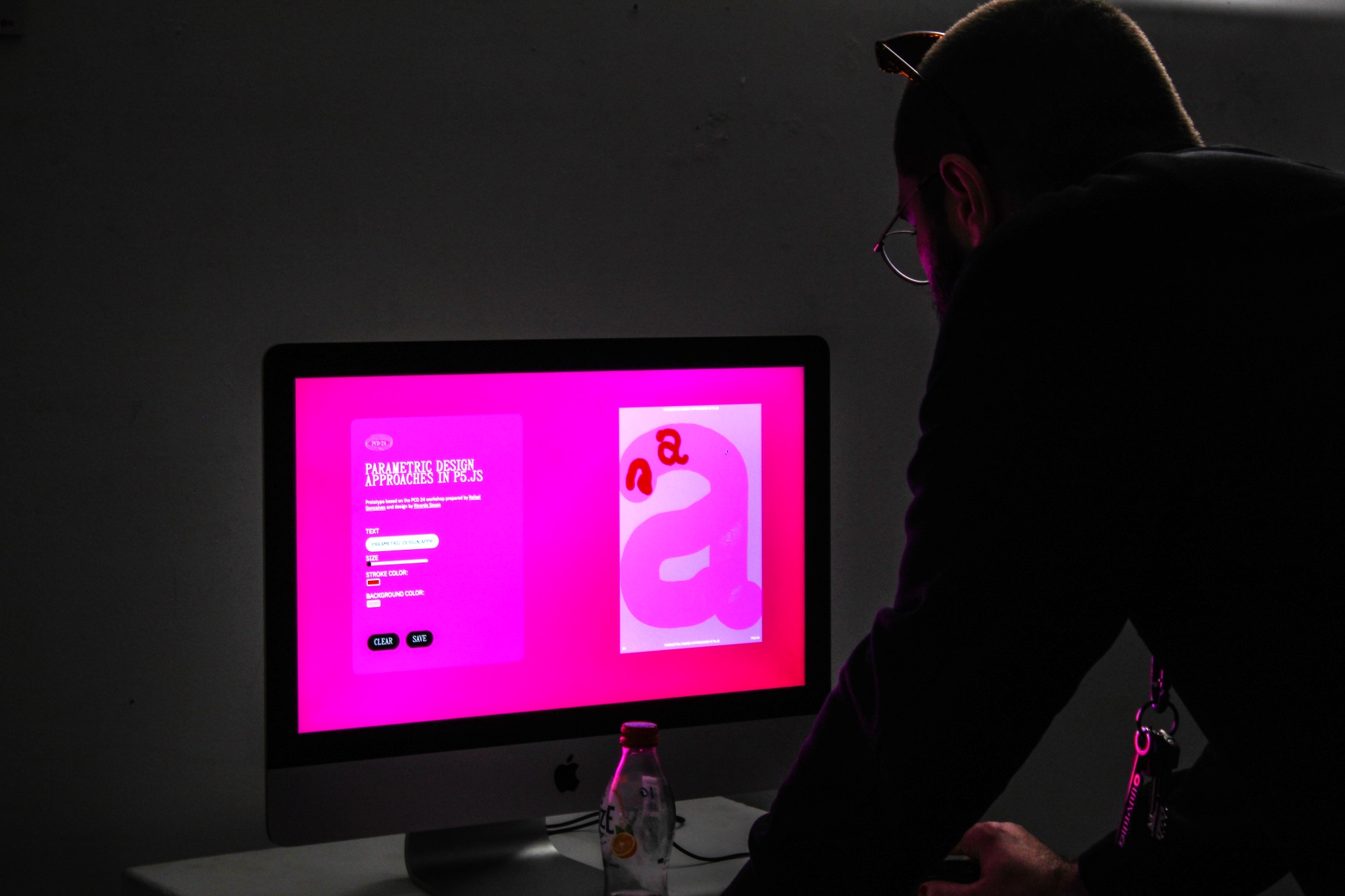
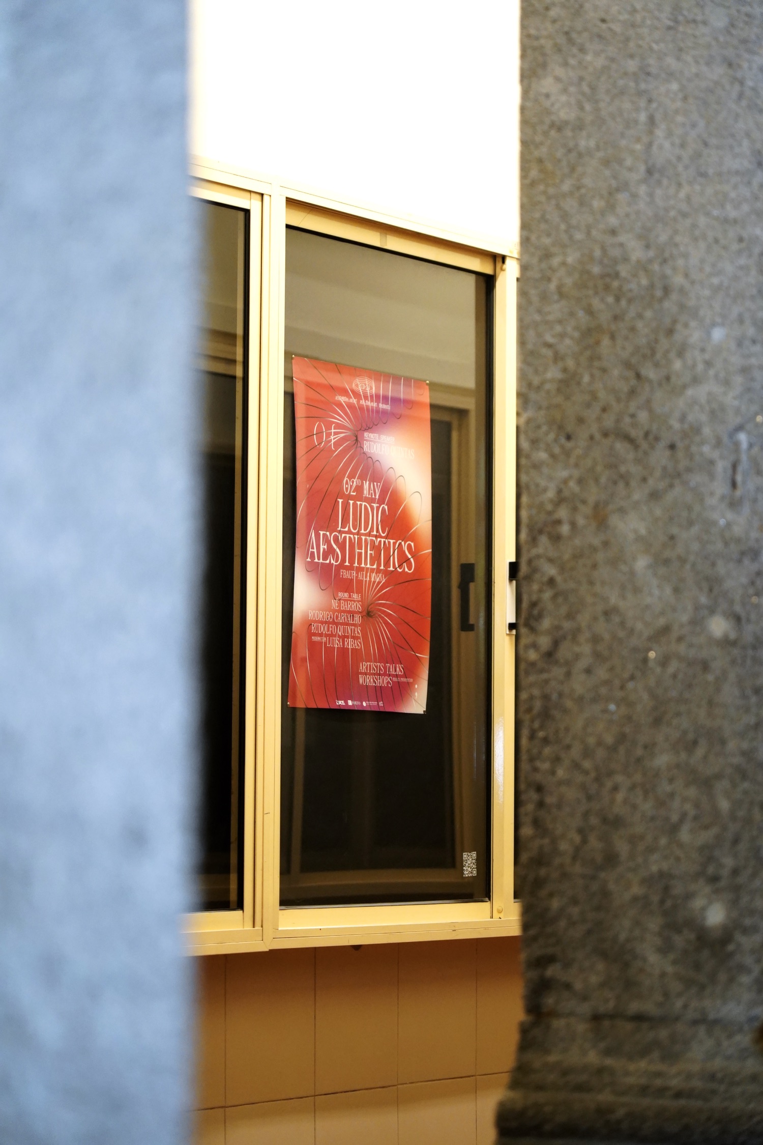
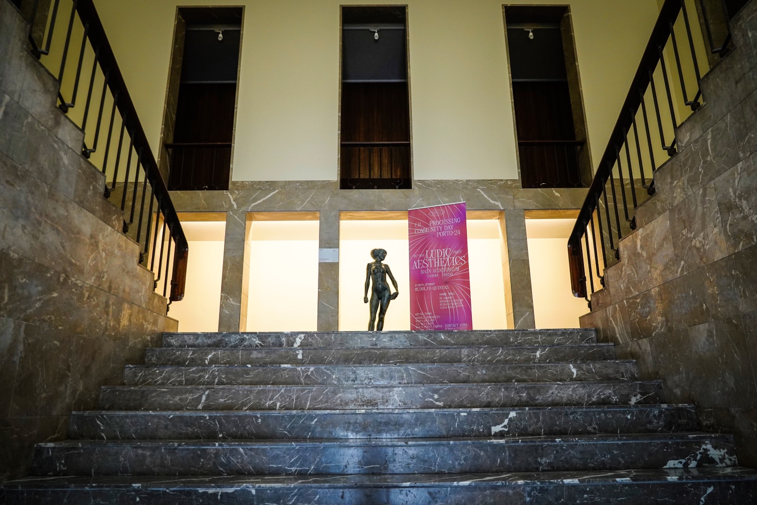
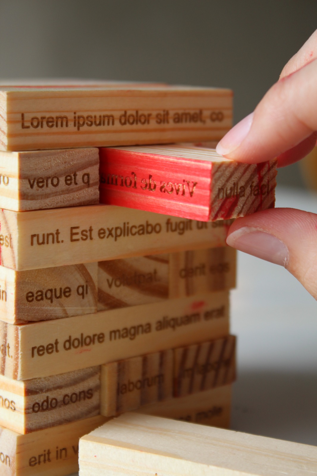
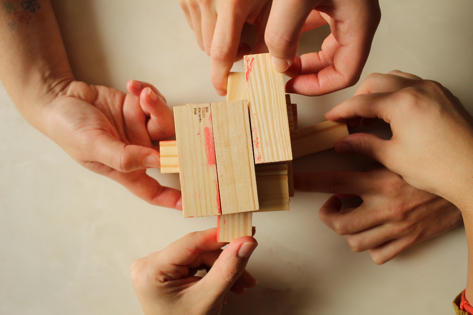
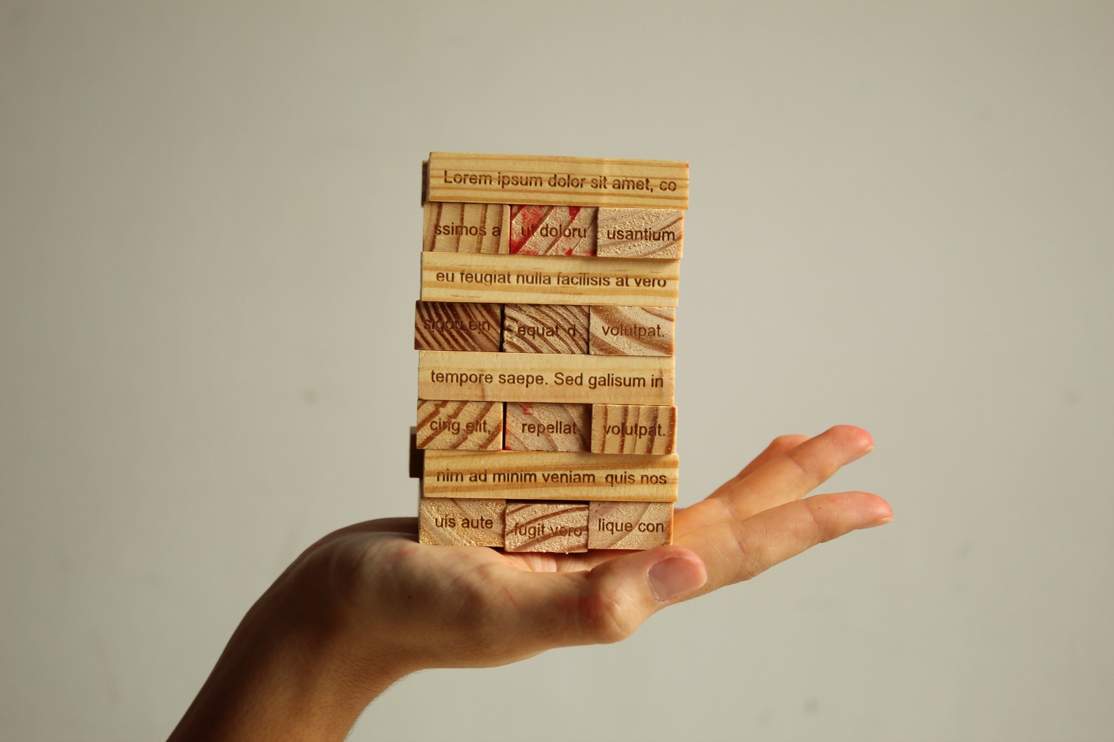
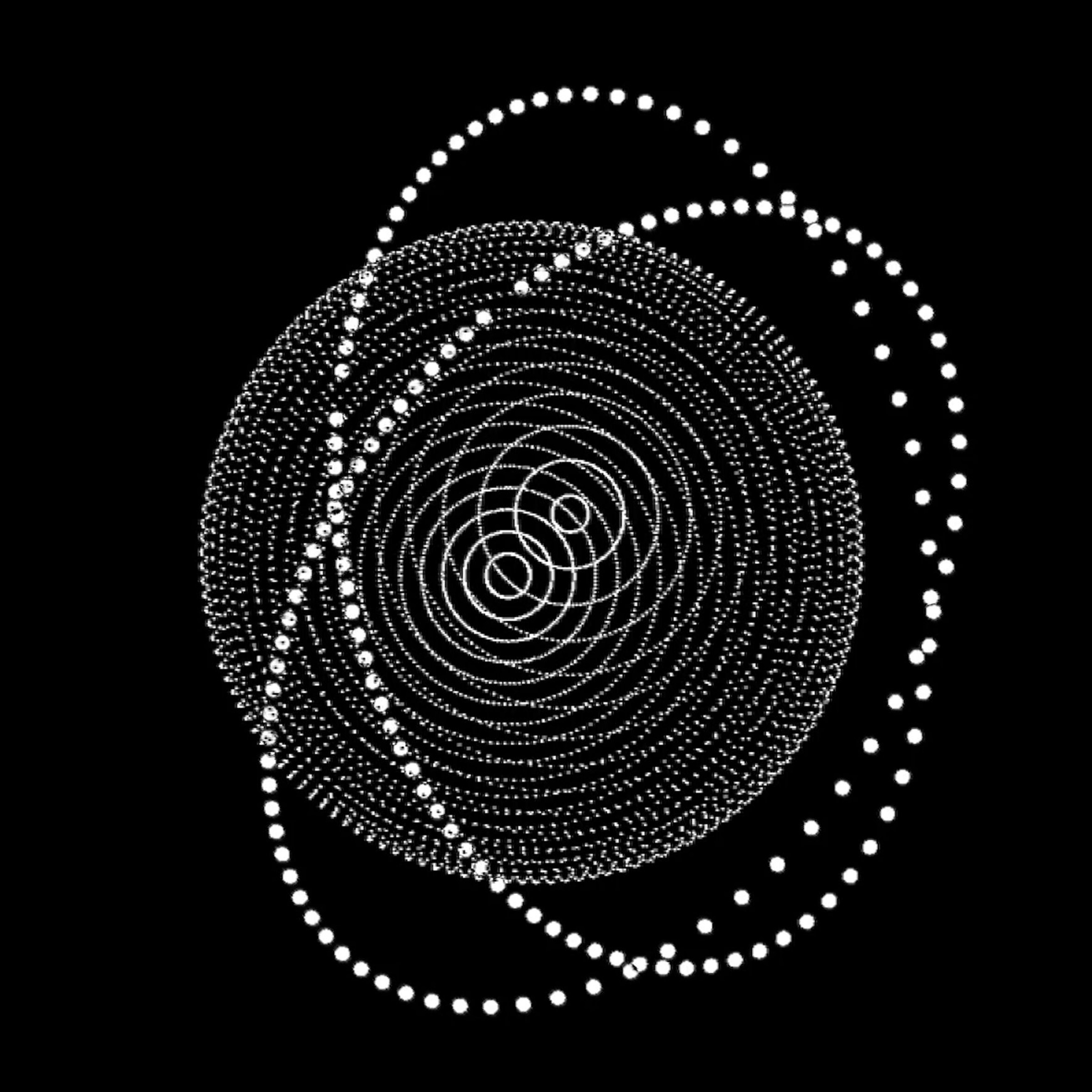
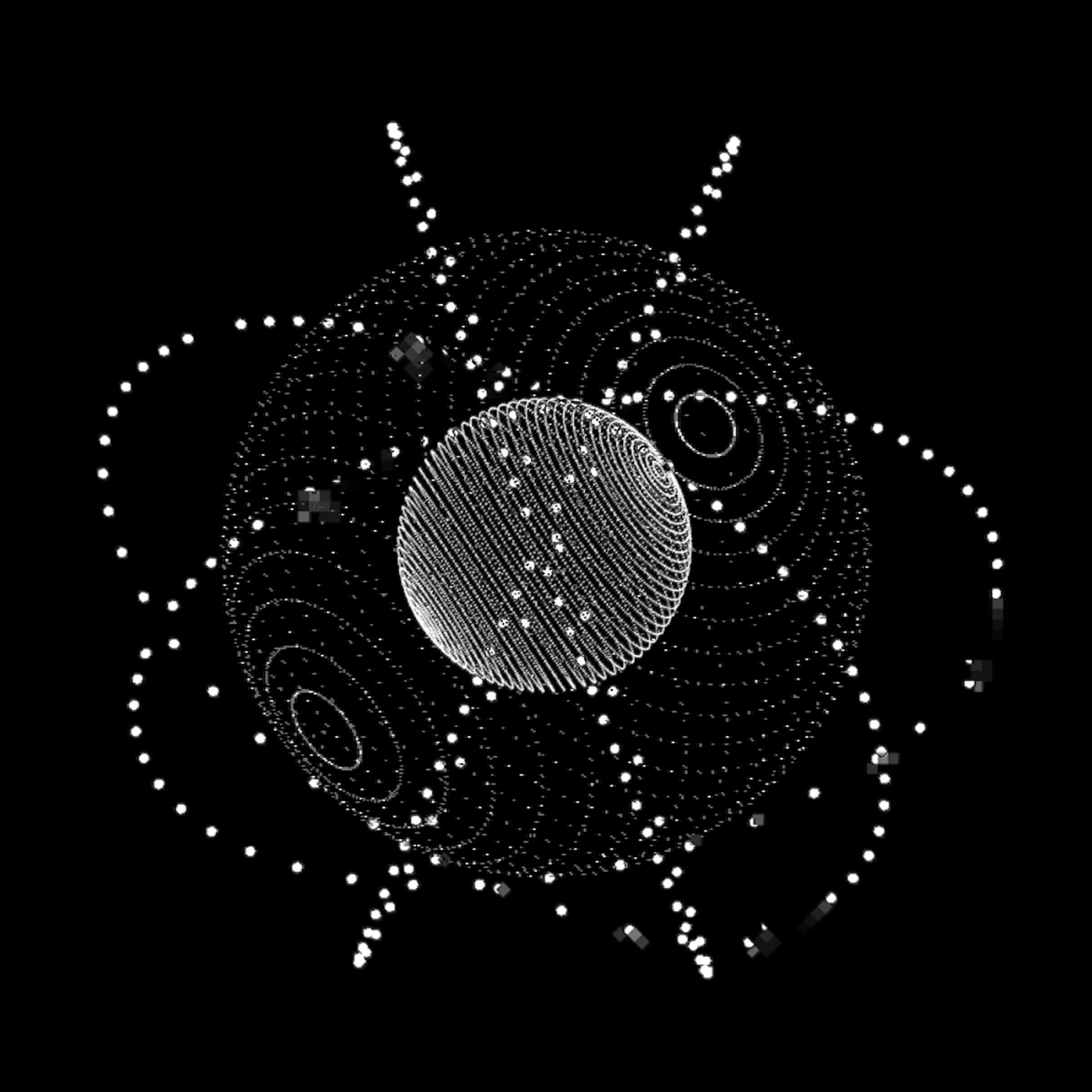
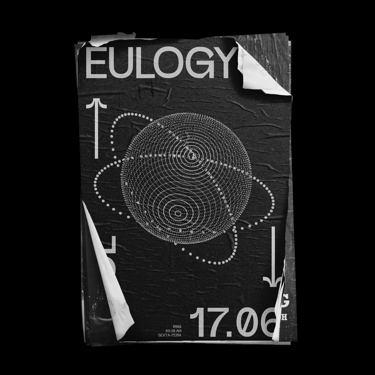
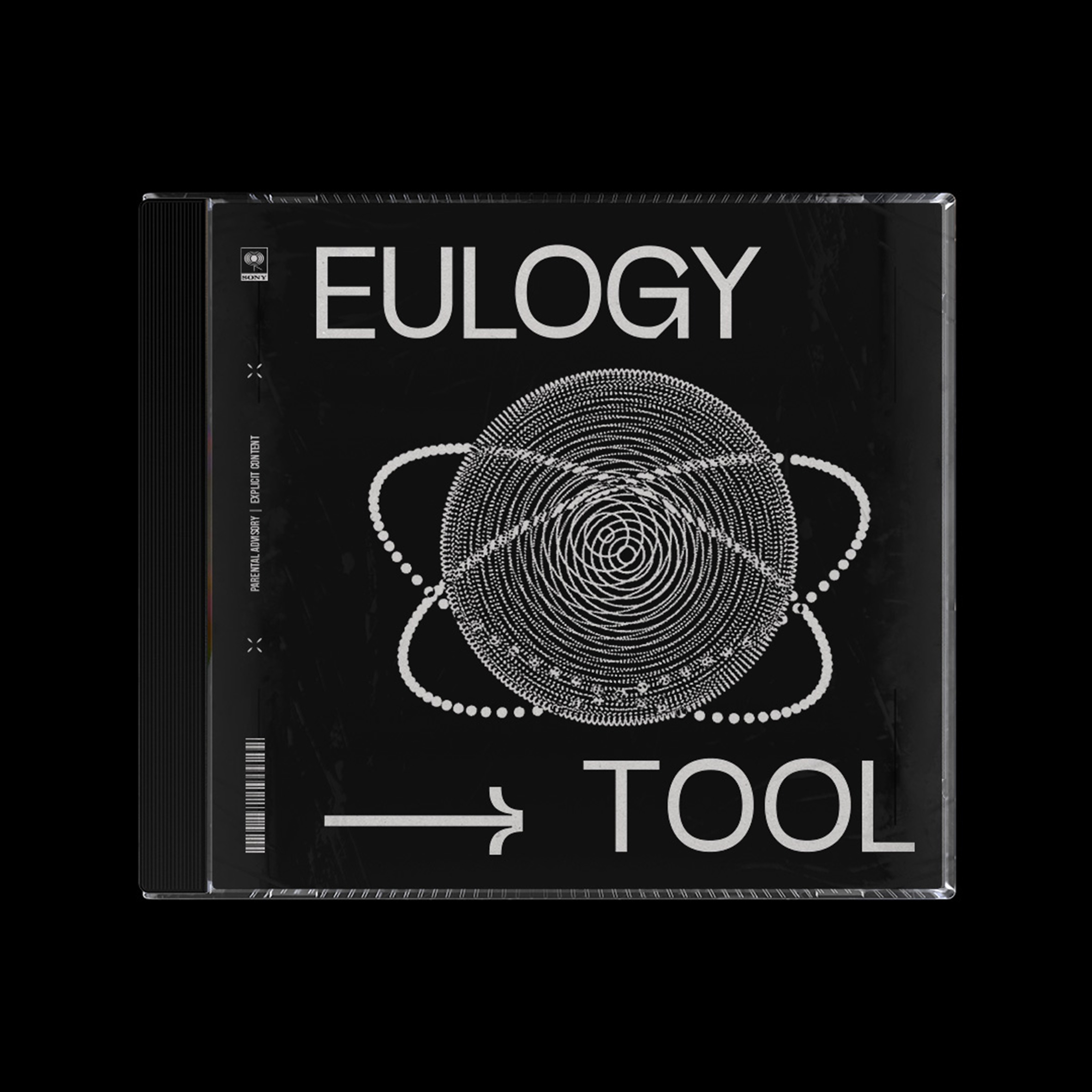
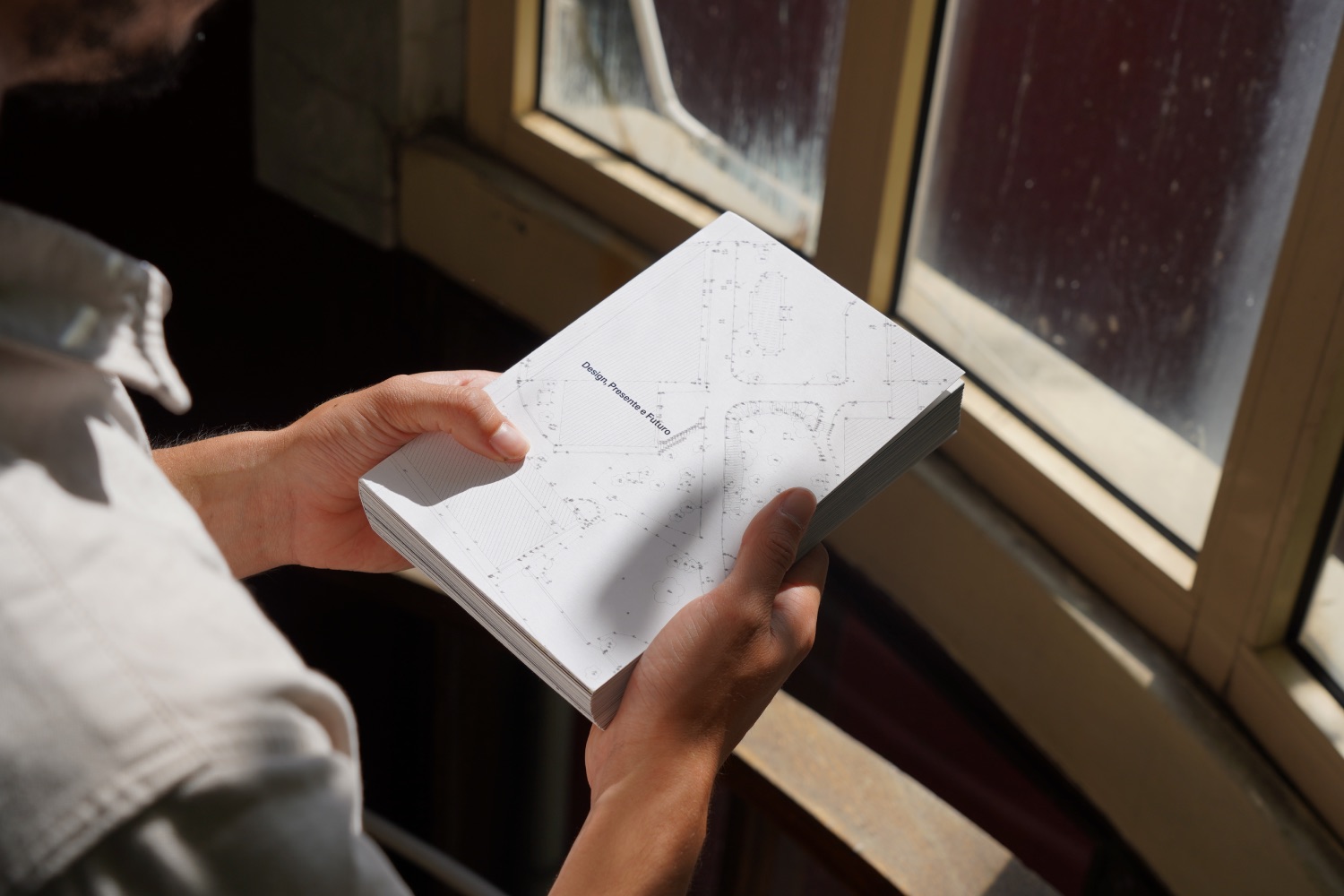
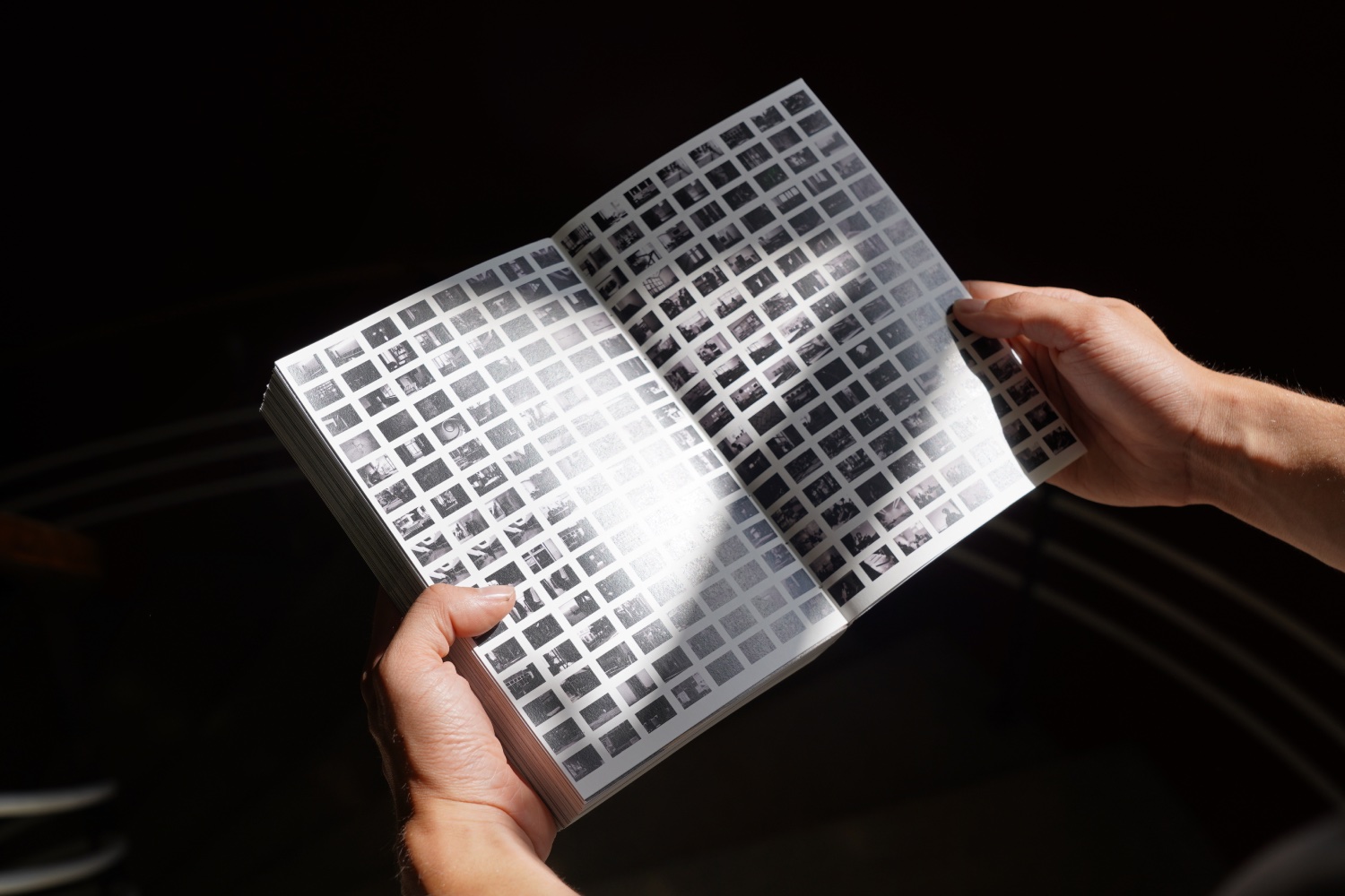
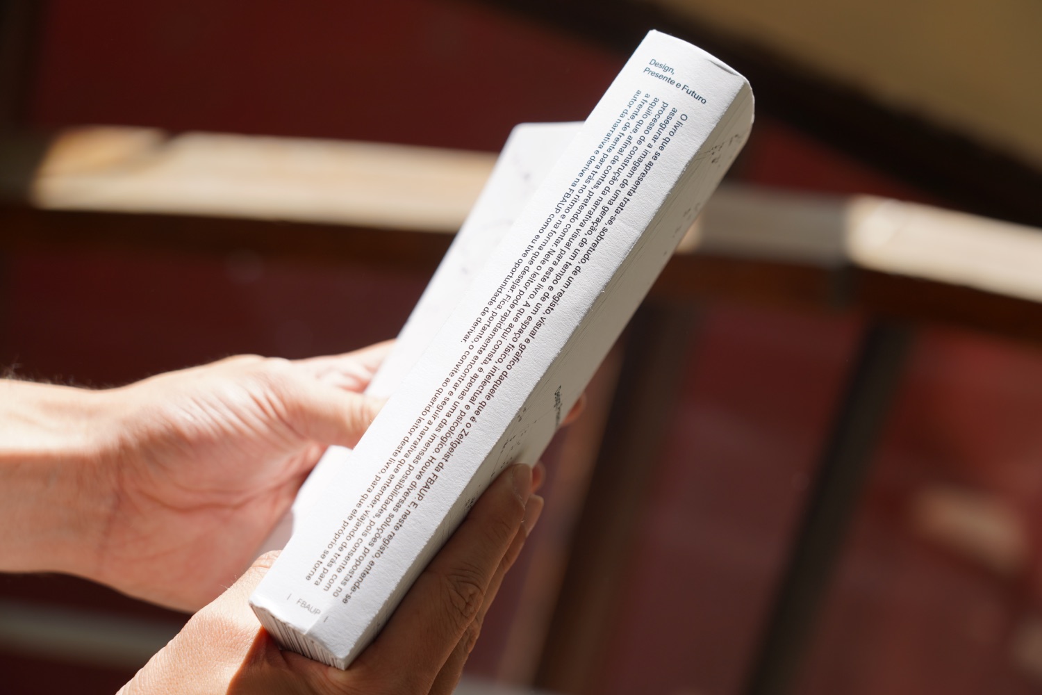
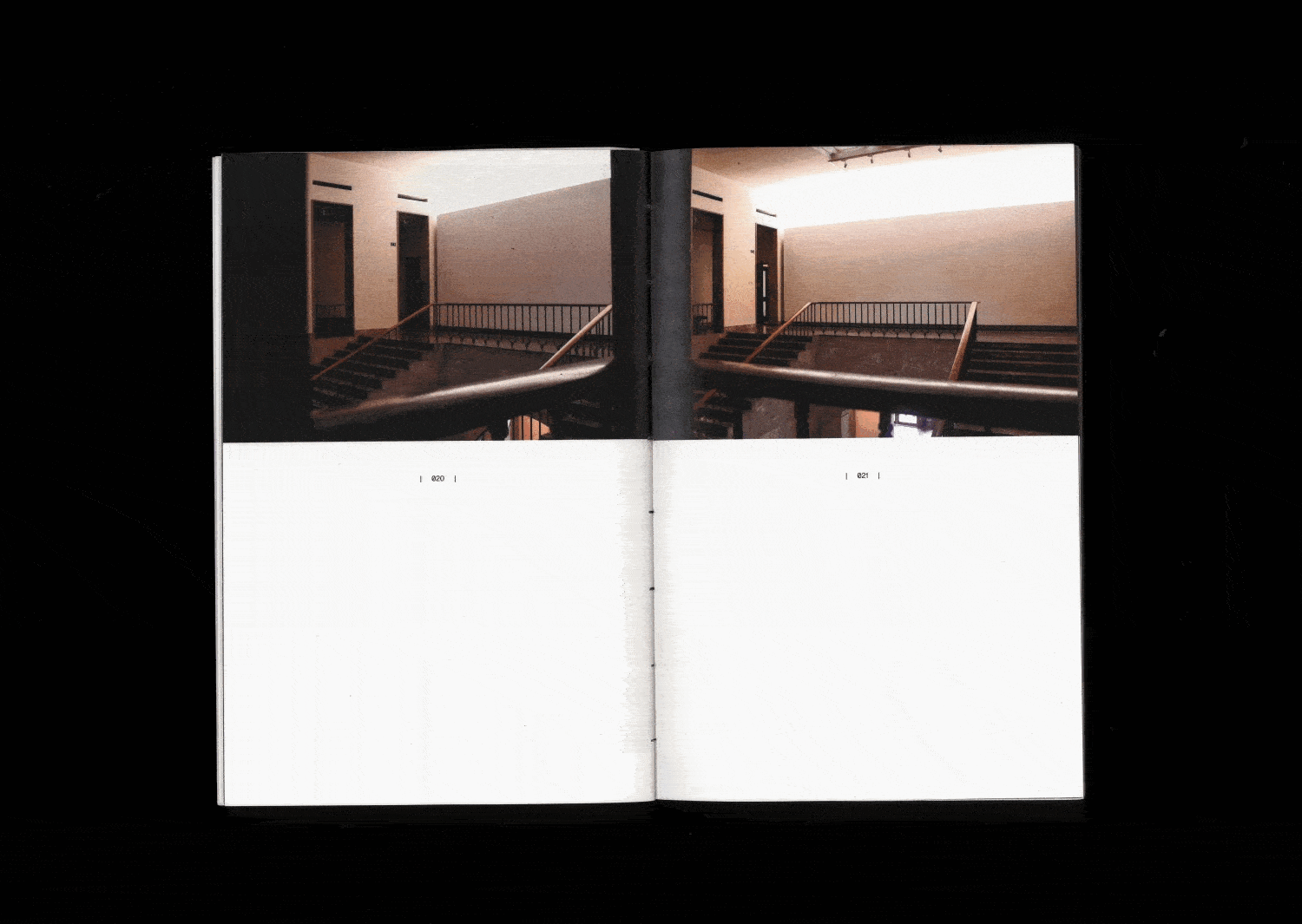
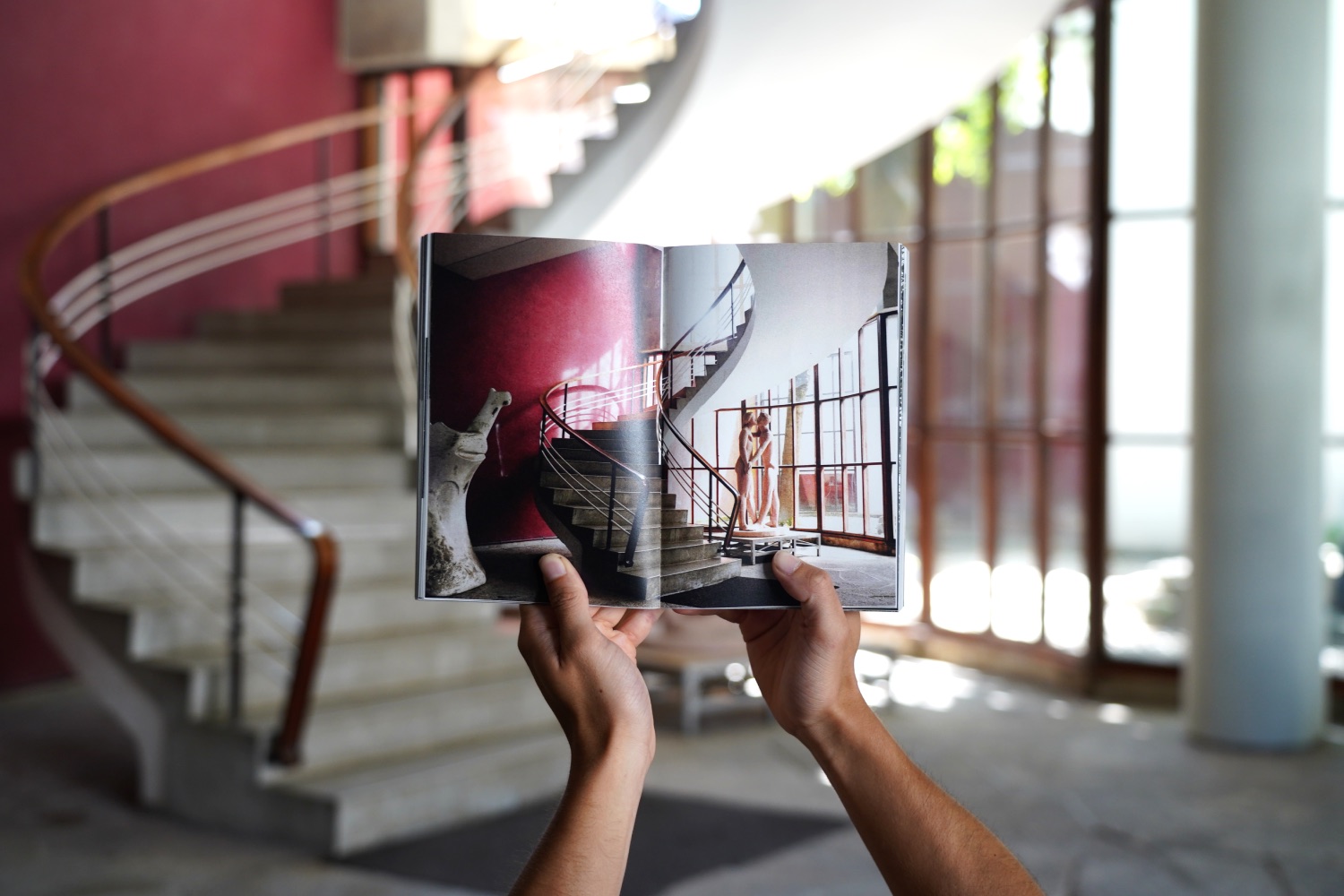
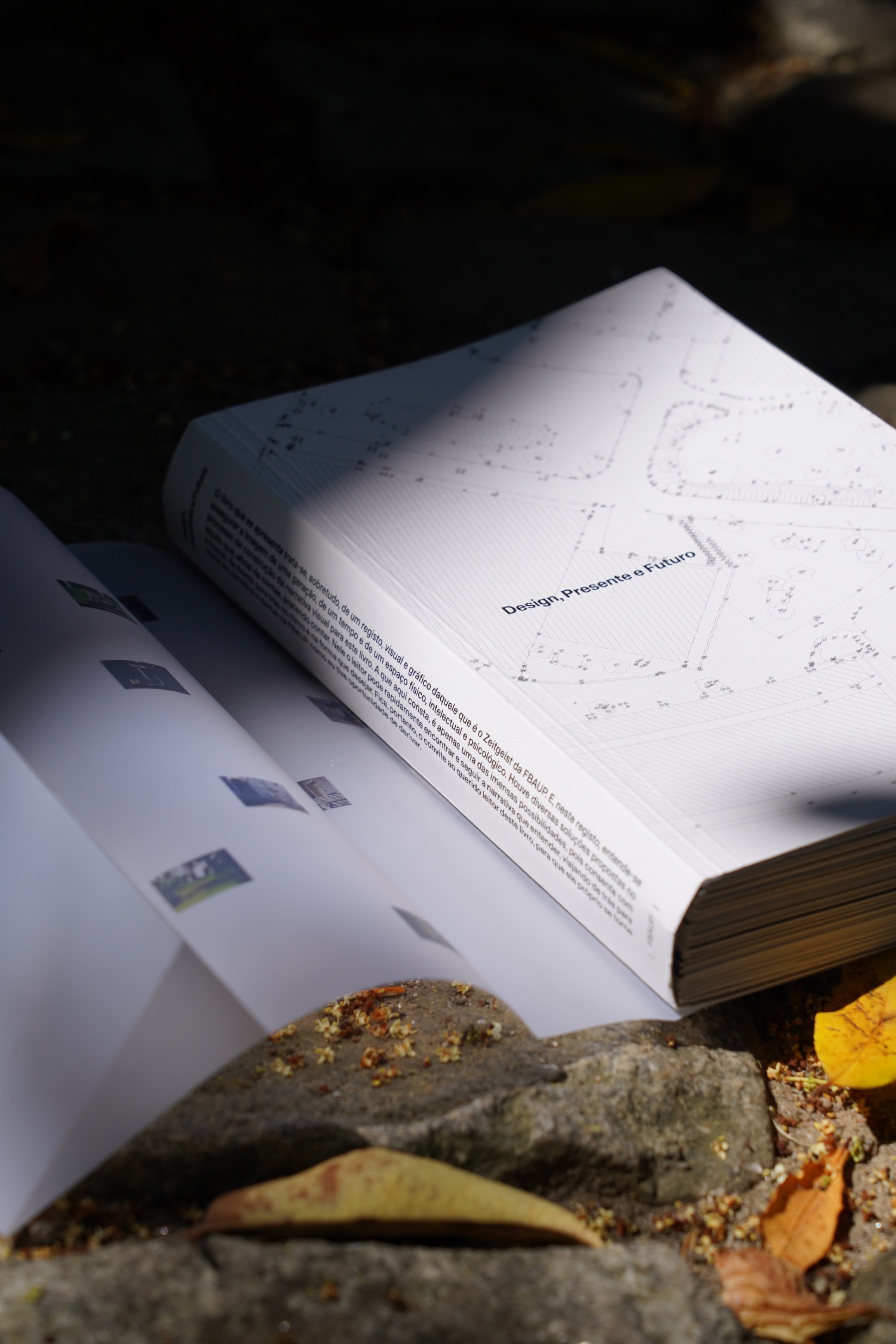
Reflecting on the conversations from the Fora D'Horas project, this BA final project aimed to serve as an archive. The object was not intended to be abstract or functional but rather a record of complex dimensions. The goal was to capture the essence of a generation, a time, and a space—physical, intellectual, and psychological. Conversations about the project introduced the concept of "Deriva"—a creative, uncommitted exploration. This approach mirrored my process of recording and stitching together moments and spaces. The result is a narrative that invites readers to create their own journey through the Faculty of Fine Artes of Porto.